
eUnify
B2B SaaS Rebrand
SERVICES
- Full Brand Identity & Repositioning
- New Logo & Visual System
- Brand Messaging & Voice
- Brand Application & Guidelines
eUnify, a community association management software provider, was operating with a dated identity that undersold the sophistication of its platform. The brand didn’t reflect the strength of the technology or the experience behind it. Compounding the problem, eUnify’s visual identity leaned on the same blue-and-green palette nearly every competitor in the space had already claimed, leaving the brand with no real way to stand out.
Execution
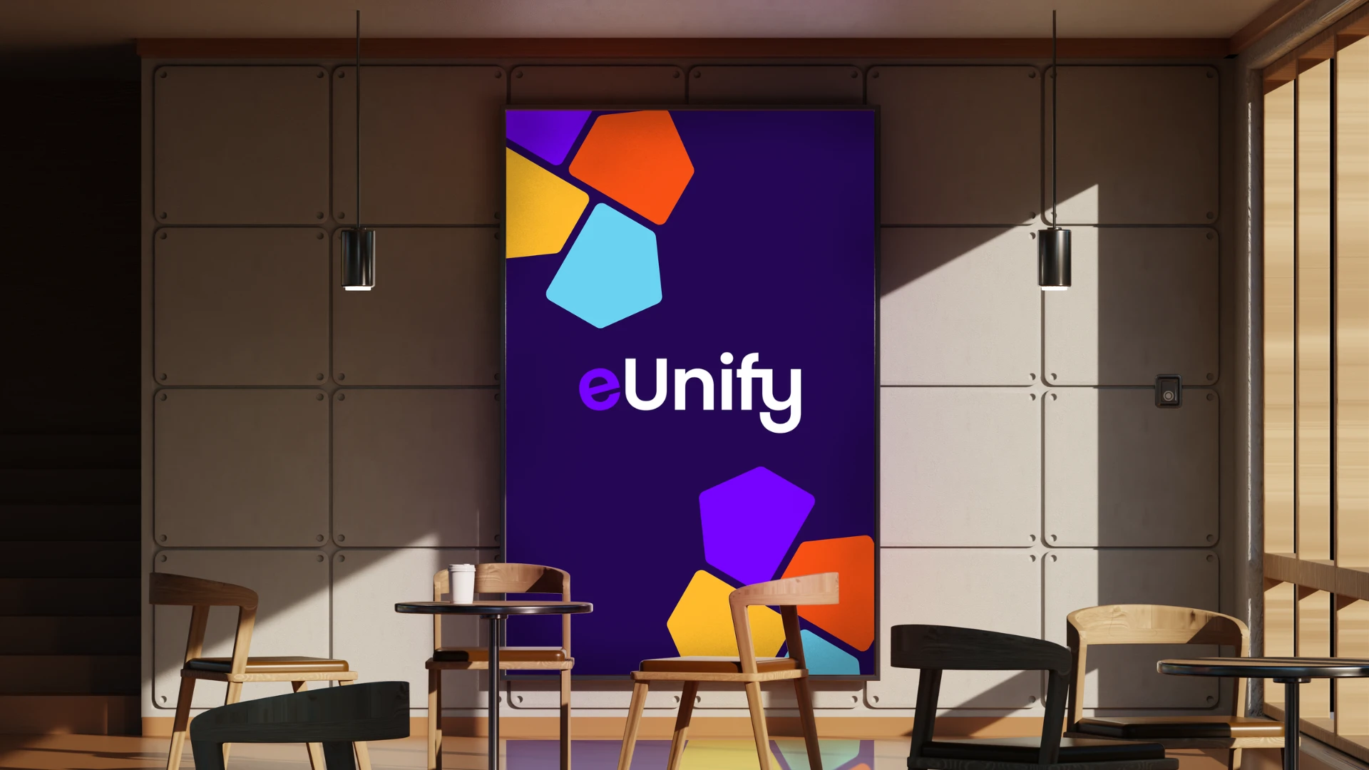
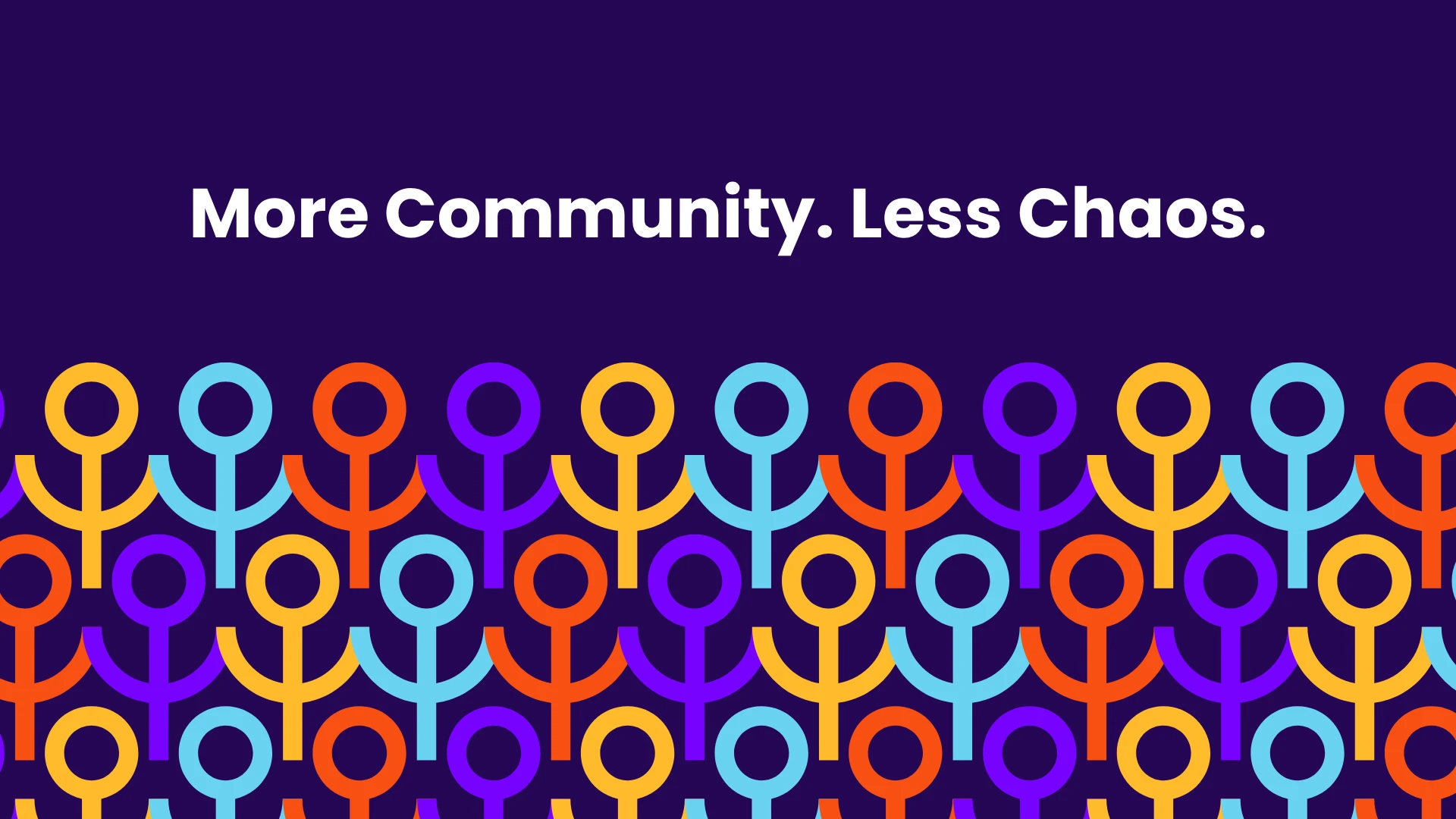
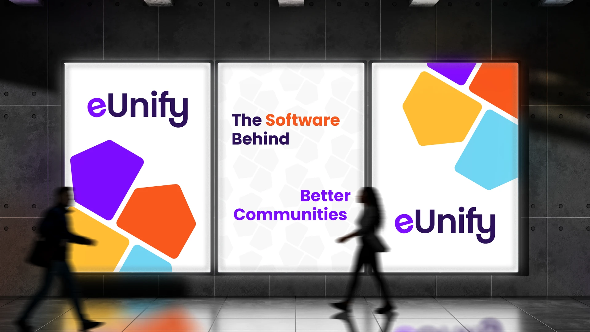
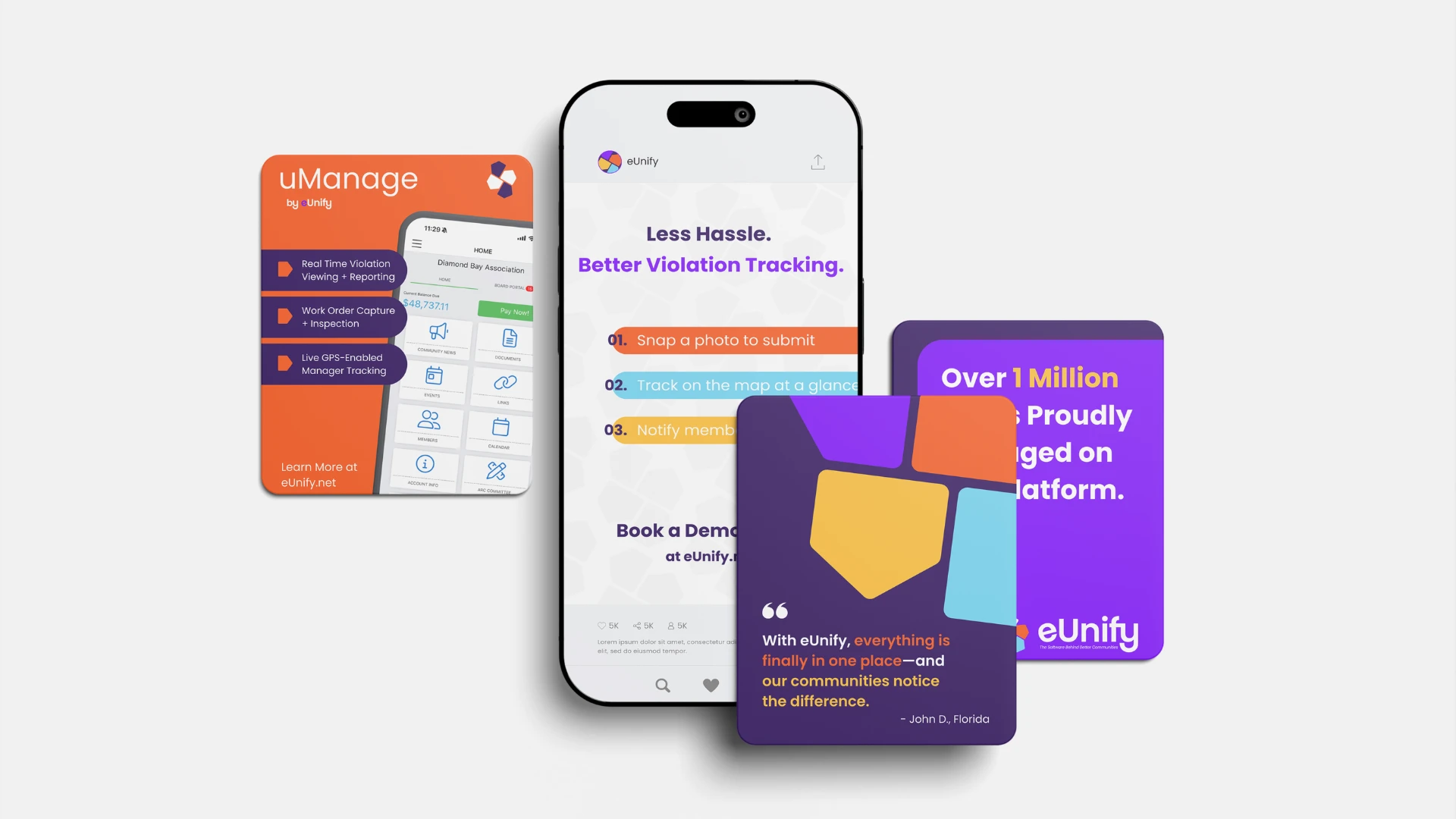
We built a modern, distinctly SaaS-feeling logo and typography system for eUnify and moved completely away from the overused blue and green in the industry. The new visual and messaging identity brought a friendlier, more vibrant energy to the brand, signaling a company that felt approachable, not corporate.
On the messaging side, we sharpened eUnify’s positioning around what the platform truly delivers: bringing communities together and improving how they live, while elevating underselling UVPs like their ongoing client support into the core of the brand story.

VISION
A future where community living works better for everyone
UNIQUE VALUE PROPOSITIONS
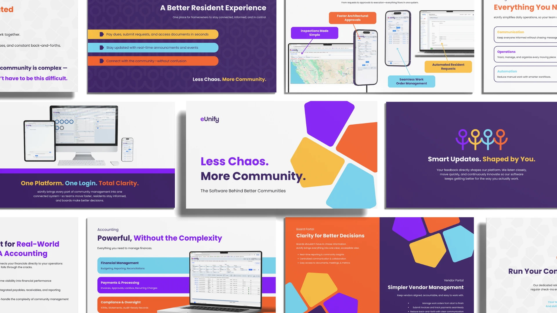
Not Just a Platform. A Partner.
Smart Updates. Shaped by You.
One Platform. One Login.
Better Operations. Better Service.


”This was one of my favorite rebrands to work on. There were clear reasons the brand needed to change, and that gave us a lot of room to take it to the next level. And what really made it work was eUnify's team. They were genuinely open to change and embraced it fully, which is always what separates a successful rebrand from one that just looks different.
Bethany BenhamCreative Lead on eUnify
eUnify, B2B SaaS Rebrand
Creative Lead & Strategy: Bethany Benham
Messaging: Bethany Benham
Visual Identity: Bethany Benham
Big Red Jelly, 2026