PRIMAL BASICS
Branding & Packaging Design
SERVICES
- Wellness Brand Strategy
- Wellness Brand Messaging
- Wellness Visual Identity
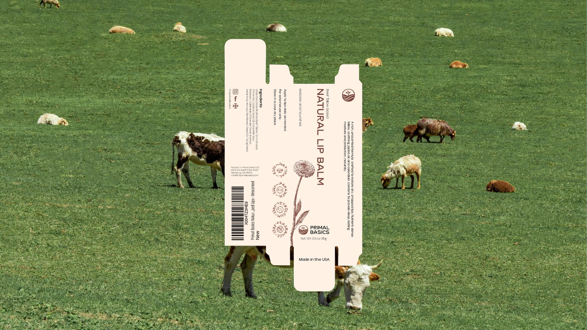
- Wellness Package Design
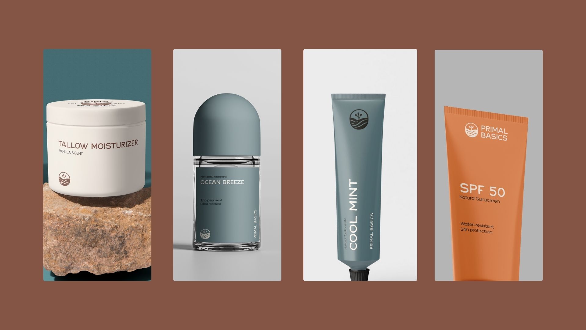
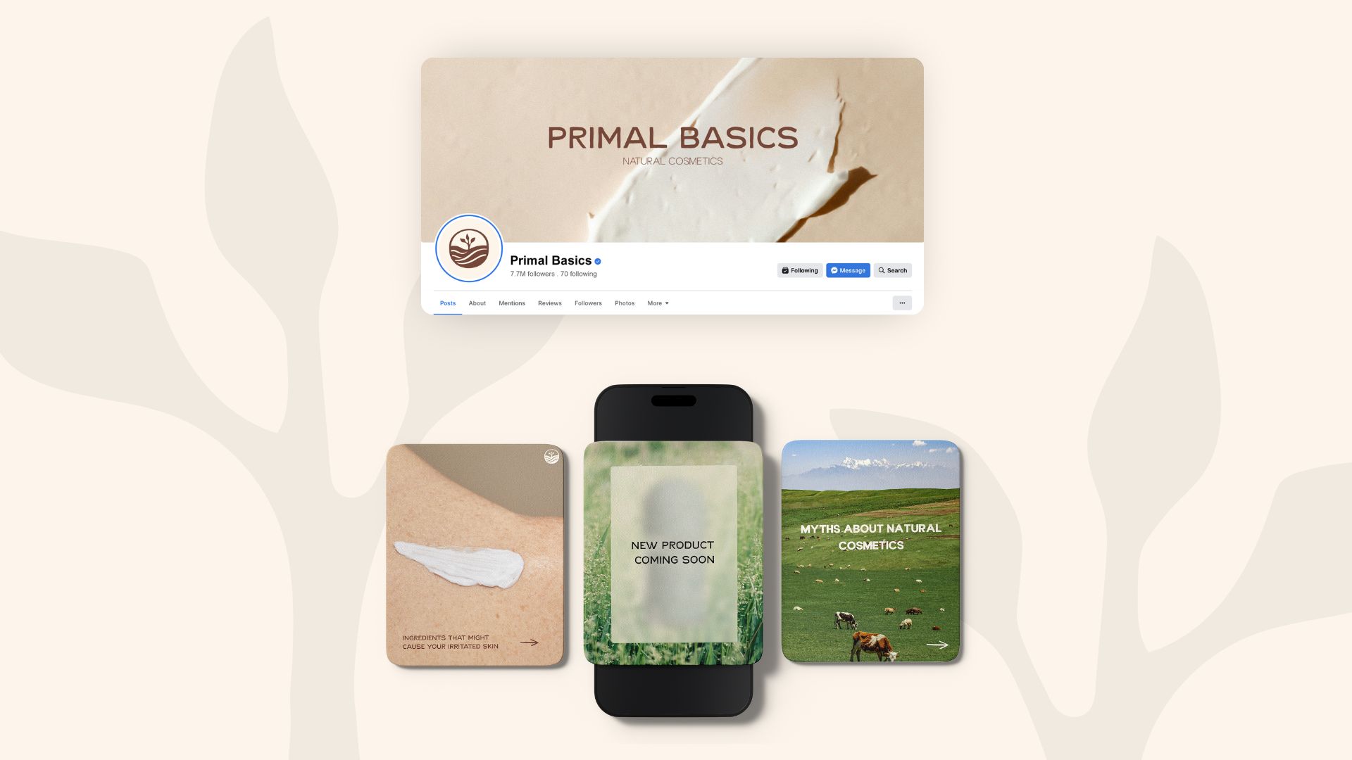
Primal Basics was growing in size and popularity, so they needed a new look that didn’t just reflect their product, but what they represent as a whole. They were ready to be more than a brand that sells beef tallow products, they wanted to be a brand that represents a way of living.
Execution
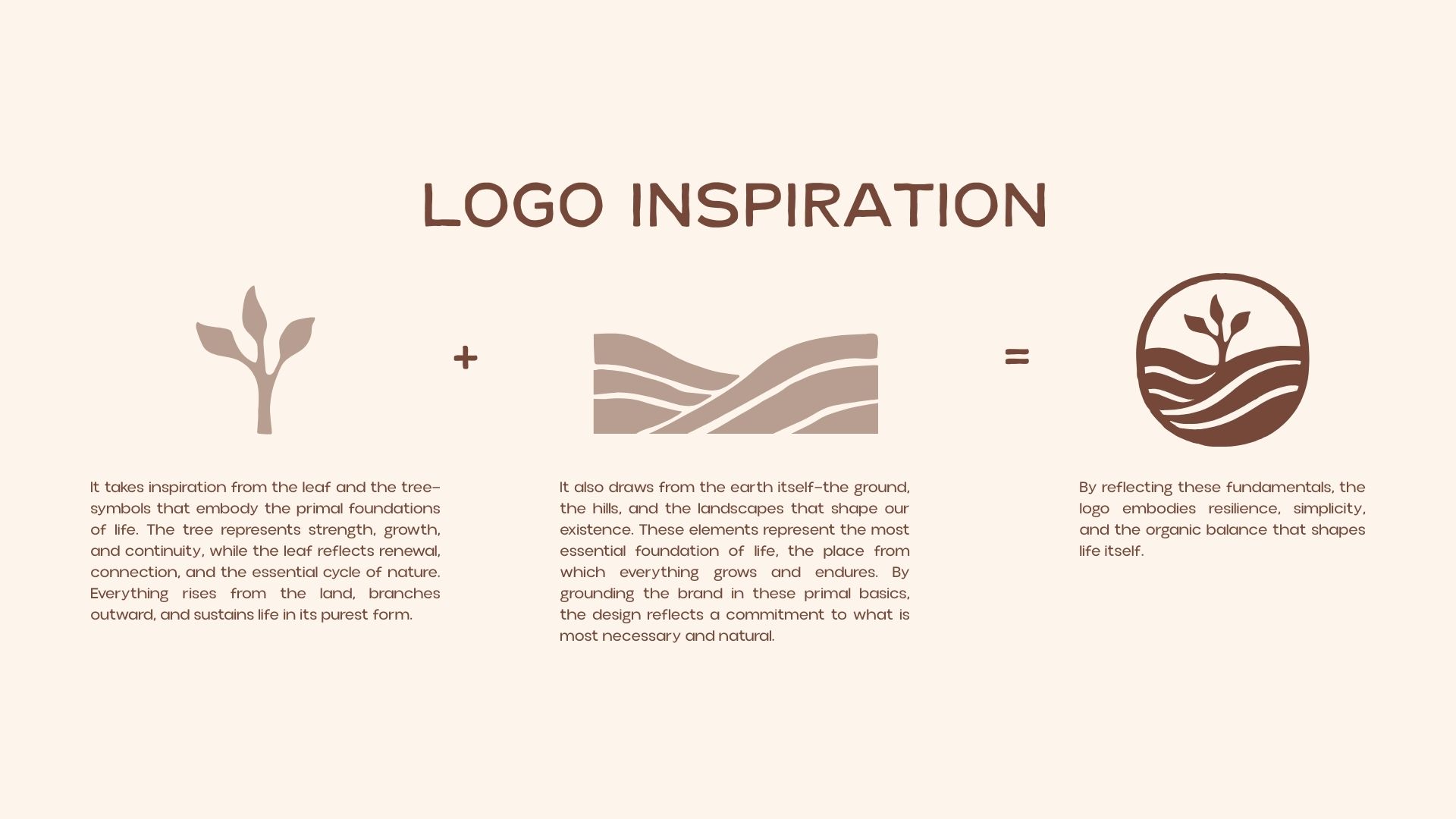
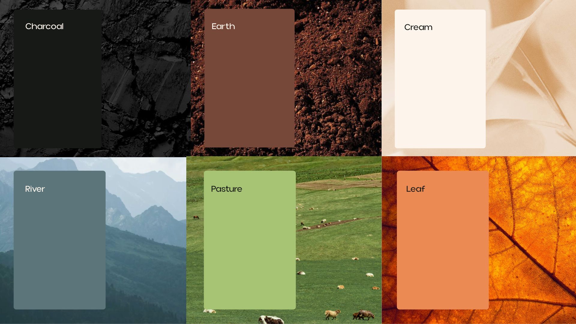
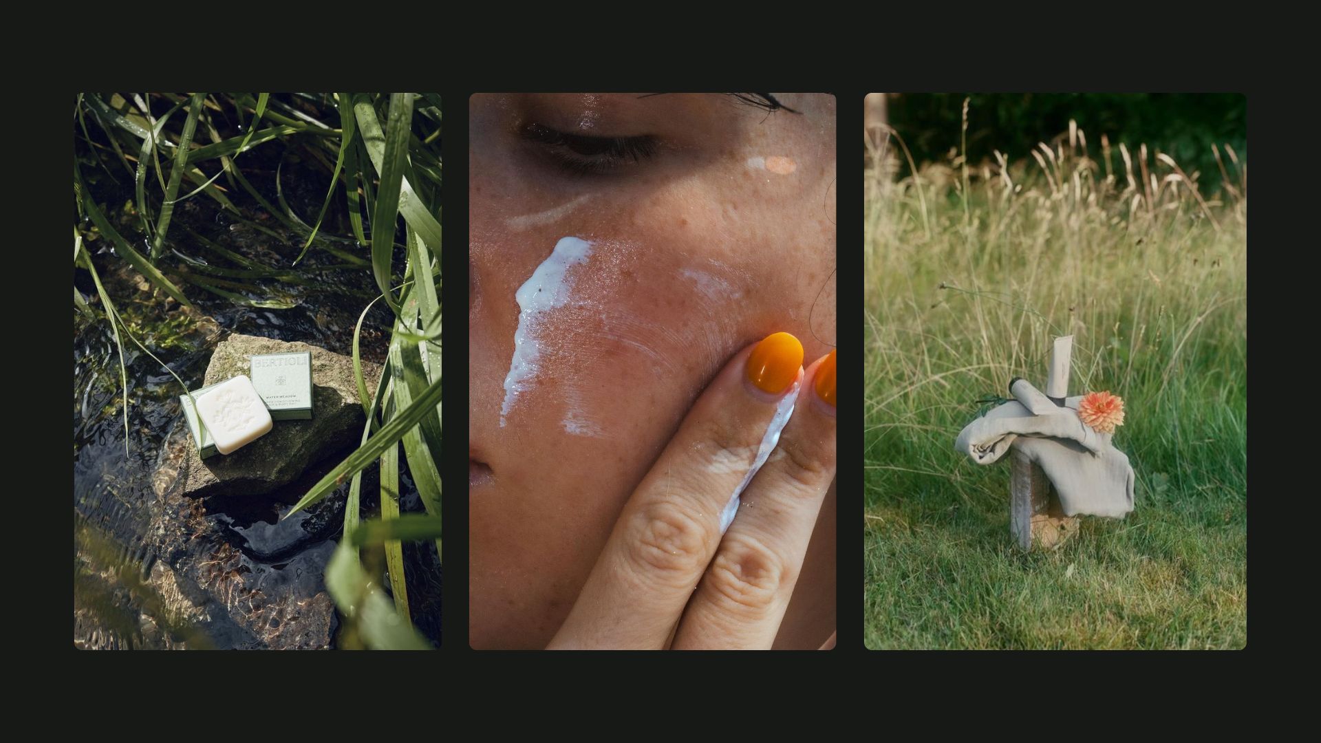
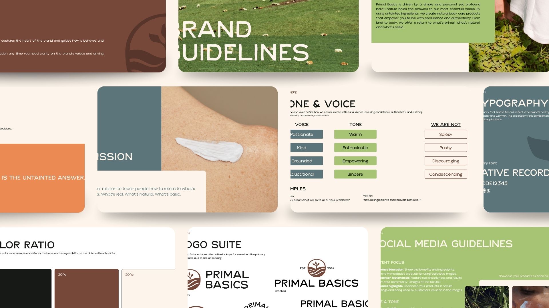
Big Red Jelly worked together with the owners of Primal Basics to create a new identity that symbolizes the one thing they wanted to communicate: undiluted nature. With millions of cosmetics products online and in stores, it’s hard to cut through the noise. Primal Basics isn’t supposed to be more noise, but represent the primal nature and basics that we need – nothing more. The brand is meant for people who want to know what goes on and in their bodies, for those that crave how humans used to live, and those who want a simple solution their body craves. We made Primal Basics a lifestyle brand that doesn’t just sell beef tallow products, but invites you to join their way of living.
OUR PURPOSE
To show people that nature is the untainted answer.
OUR MISSION
It is our mission to teach people how to return to what’s primal. What’s real. What’s natural. What’s basic.

”Working on Primal Basics meant transforming a product-led brand into a lifestyle—one that honors simplicity, natural living, and a return to what our bodies truly need.
Tabea PurtschertCreative Lead on Primal Basics
Primal Basics, Wellness Branding & Packaging Design
Creative Lead: Tabea Purtschert
Messaging: Tabea Purtschert
Visuals: Tabea Purtschert and Paola Ocando
Big Red Jelly, 2025