BA Jewel company logo business card mockup graphic design at Big Red Jelly.

Problem

B.A. Jewel Fitness did not know where to begin when it came to carving out their personal brand and communicating that brand effectively online. They had an idea of the direction they wanted to take the brand but did not know how to put their ideas to work.

Solution

The Big Red Jelly branding team worked with the B.A. Jewel Fitness team to design a logo that reflected the personality and vision of the company. The design needed to be happy, playful, and modern.

Project Type

Brand Startup

BA Jewel company logo business card mockup graphic design at Big Red Jelly.

Problem

B.A. Jewel Fitness did not know where to begin when it came to carving out their personal brand and communicating that brand effectively online. They had an idea of the direction they wanted to take the brand but did not know how to put their ideas to work.
Solution

The Big Red Jelly branding team worked with the B.A. Jewel Fitness team to design a logo that reflected the personality and vision of the company. The design needed to be happy, playful, and modern.

Project Type

Brand Startup

Behind every great brand is a great story

A strong brand identity is essential to gain and retain customers. B.A. Jewel Fitness aims to be perceived as friendly, playful, modern, professional, and feminine. Who said every fitness brand needs to be dark, brooding, serious? We thoughtfully designed their logo with bright, welcoming colors and a sophisticated, feminine font to appeal to their target audience. 

BA jewel fitness graphic by branding at Big Red Jelly.

Choosing Colors

As a YouTube content creator and certified personal trainer, the owner of B.A. Jewel Fitness had a theme in mind when they talked to our team about colors. They wanted a bright, motivating, and feminine color palette that would resonate with their target audience: women.

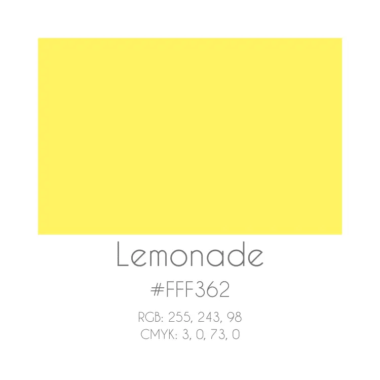
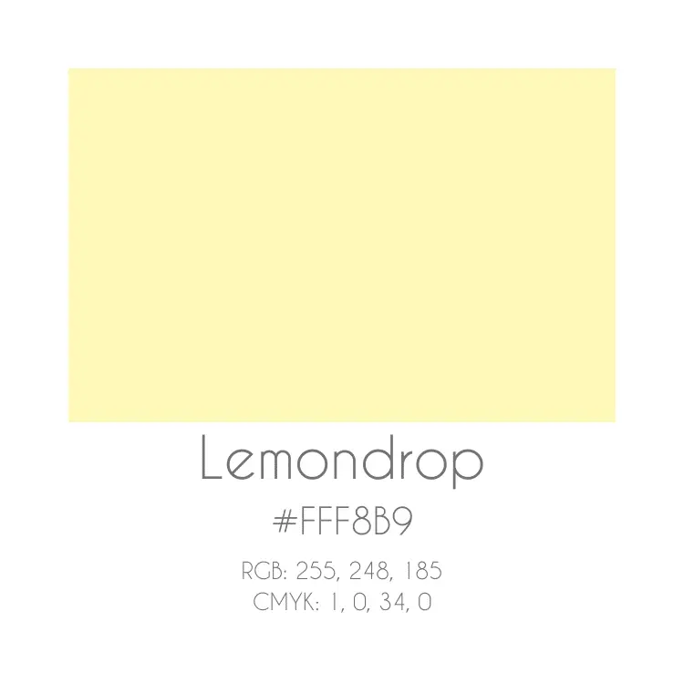
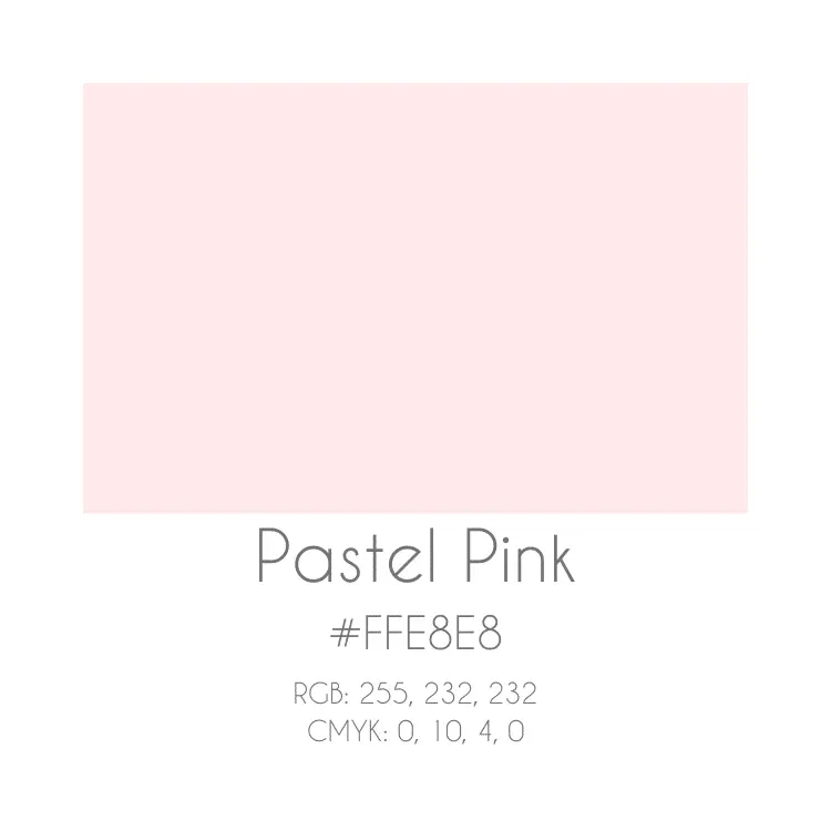
The owner of B.A. Jewel Fitness had a tagline in mind before starting the project: Let’s Make Lemonade. With that in mind, the branding team chose colors that reminded them of “pink lemonade”. The vibrant pink and yellow, complimented by the softer pinks and yellows, formed a cohesive palette that B.A. Jewel Fitness could use for their YouTube channel, social media platforms, and website.

BA Jewell icon - graphic design Big Red Jelly Provo Utah. BA Jewell icon - graphic design Big Red Jelly Provo Utah.

Designing the Logo

With the color palette and tagline in mind, the branding team created an icon-focused logo. Because the company wanted a modern, yet playful design, our team used smooth lines. negative space, bright colors, and fonts to their advantage.

The company wanted an icon that would be immediately recognizable on social media. The design had to be simple, chic, and not overwhelming. The use of contrasting colors and the pop of green added dimension to the icon of the logo: the lemonade glass.

B.A. Jewel Fitness needed a fun, lively, confident, and easy to recognize brand that would propel them to success.

Lyndsie OrenoBig Red Jelly Brand Strategist

Brand Style Guide

Brand Style Guides, Brand Guidelines, Brand Bibles – no matter what you call them – are imperative for a cohesive brand identity. The visual identity and messaging found in Brand Style Guides influence all areas of presentation. The guideline instructs everything from website design to email marketing, from social media to product packaging, and from internal communications to marketplace portfolios. Every company serious about their online and offline identity and interested in seeing large growth needs a Brand Style Guide to follow religiously.

BA jewel fitness design page brand style guide - brand development at Big Red Jelly.

Like What You See?

Request a free quote or schedule a brand consultation today