Pain Points
Dated visual identity
Unclear market positioning
Jargon-heavy content
Disjointed brand experience
Solutions
Premium brand system
Custom WordPress build
Audience-tiered content
Full rollout & packaging
Tech Stack
WordPress
FieldRoutes
CRM Semrush
Google Ads

Meet Credence Genomics
Credence Genomics is a leading-edge pathogen detection company that uses advanced DNA sequencing to identify infectious agents. In a field still dominated by culture-based methods, where samples are grown in petri dishes over several days, Credence provides a digital, data-driven alternative that identifies the genetic fingerprint of pathogens with near-perfect accuracy and a fraction of the turnaround time.
Their science was ahead of the category. Their brand and digital presence were not. Credence came to Big Red Jelly for a visual identity and website that reflected their status as an evolutionary force in the medical world.
They did not want a disruptive rebrand that would alienate legacy practitioners. They wanted a brand that positioned them as the next logical step for the medical community.
Brand & Build Level
Pro
Grow Level
Pro
Industry
Biotech & Pathogen Detection

The Challenge: A World-Class Science Company With a Dated Brand
Credence had built technology that outperformed the category standard, but their digital presence did not signal that authority. In the medical space, that creates a second problem. A brand refresh risks alienating the very doctors and nurses you need to adopt the new tool, because decades of training and confidence are tied to the old method.
They were missing:
- A visual identity that matched the sophistication of the technology
- Clear category positioning that elevated rather than replaced clinical expertise
- A content structure built for three distinct buying personas
- A website built for a high-trust, highly technical audience
- Brand continuity between the old identity and the new one
- Packaging and collateral that reinforced a premium biotech experience
The Solution: Positioning Credence as the Next Evolution
Big Red Jelly ran our Proven Process across Brand, Content, Build, and Rollout phases. Joshua Lee led brand strategy and identity, and Ammon Galvez translated the system into a high-performance WordPress build. The goal was a brand that doctors, nurses, and distributors would trust as an upgrade to their existing expertise rather than a disruption of it.


Part 01 | Strategy & Positioning
A Semantic Shift From Disruption to Evolution
Joshua Lee spent the first two weeks of the project immersed in the science of DNA sequencing before writing a single line of strategy. That depth allowed us to identify the real risk. Framing Credence as a disruption would position the old methods as wrong, and would alienate the practitioners who had to adopt the new technology.
Our strategic answer was to position Credence as the Next Evolution. That allowed medical professionals to adopt the technology as an upgrade to their existing expertise rather than a replacement of it.
Our work included:
- Deep discovery and technical research on DNA sequencing workflows
- “Next Evolution” positioning that honors legacy clinical expertise
- Audience definition across three distinct personas (nurse, doctor, distributor)
- Tone of voice that is technical, confident, and premium
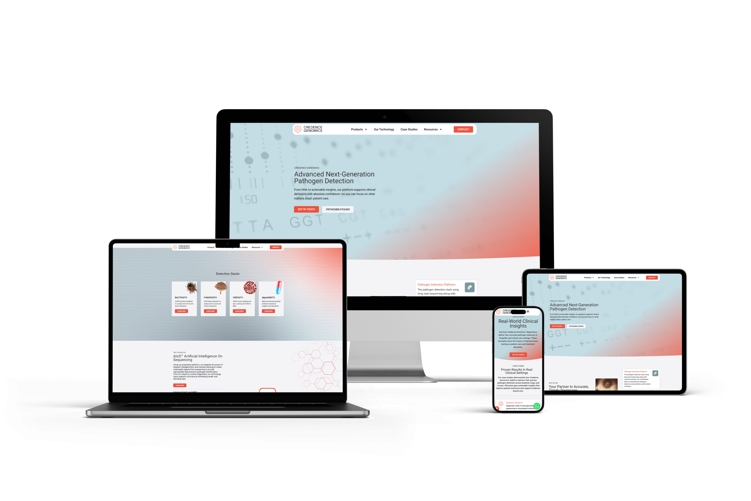
Part 02 | Visual Identity
A Premium, Tech-First Visual System
We intentionally broke away from hospital blue and clinic green in favor of a bold, high-contrast identity that stands out in a marketplace of sterile, soft-colored competitors.
Deliverables:
- A black, white, and red palette that signals urgency, authority, and premium tech
- A logo reimagined as a Protective Shield built from a pentagon, circle, and rectangle, referencing the five protein complexes in a DNA double helix
- A custom genetic pattern built from a repeating T, C, G, A sequence, the actual nitrogenous bases of DNA
- A Brand Guide designed to support scientific papers, presentations, and packaging


Part 03 | Content Architecture
A Three-Tiered Content Strategy for a Technical Audience
Highly technical companies often struggle to explain what they do without losing the audience in jargon. We organized the site around the three distinct people who visit it.
Our content framework included:
- The Nurse or Gatekeeper, who needs hands-on applicability and clinical efficiency
- The Doctor or Decision-Maker, who needs statistics, case studies, and proof of accuracy
- The Distributor, who needs fast access to product specs and bulk ordering information
- A Logo Animation Video that acts as a Brand Bridge, morphing the legacy logo into the new emblem to reassure existing clients
Part 04 | Website Build
Engineering a Digital Laboratory
Ammon Galvez led the build on a high-performance WordPress tech stack, then collaborated with Joshua on a mid-build design pivot when the initial “Dark Mode” aesthetic felt too heavy for the client’s vision. The result was three custom-engineered gradients that add light and air without sacrificing the bold, premium feel.
Key upgrades included:
- A Custom Case Study Engine built to host clinical evidence in a blog-style architecture
- Active clinical imagery (real hands, real labs, real technology) instead of “smiling doctor” stock photography
- A Loom-powered feedback loop for hyper-specific, asynchronous corrections on medical terminology
- An optimized journey for the Gatekeeper persona, with technical information front and center


Part 05 | Rollout & Brand Activation
Launching the Evolution
Our Rollout Phase made sure the new identity lived across every touchpoint, not just the website.
Deliverables:
- The T, C, G, A genetic pattern applied to physical pathogen detection kits
- An online Brand Guide finalized and handed off for future marketing and scientific papers
- A site optimized for the Gatekeeper journey with the most relevant technical information up top
- A consistent brand experience from the website all the way to the lab bench
Bring It All Together
Credence Genomics now has a premium biotech brand that functions as a strategic tool to drive adoption.
Premium Identity
A bold, tech-first brand system that signals authority in a marketplace of soft-colored competitors.
Strategic Tools
A Custom Case Study Engine and Loom-based feedback loop built to support a highly technical audience.
Marketing Support
Big Red Jelly delivered a full Brand Guide and rollout package, giving Credence the tools to maintain a consistent biotech identity across every future asset.
5
5 protein complexes in the DNA double helix, represented inside the new Protective Shield logo.
3
3 distinct buying personas mapped and integrated into the site architecture.
4
4 full phases of the Proven Process delivered across Brand, Content, Build, and Rollout.
The Conclusion: A Brand as Smart as the Science
Through deep discovery, careful “Next Evolution” positioning, and a custom-built digital laboratory, Credence Genomics now has a brand that finally matches the sophistication of its technology. The brand does not just look better. It works as a strategic tool to drive adoption in the medical community, and it positions Credence as a recognized leader in the next evolution of DNA sequencing.
2
2 weeks of immersive discovery into DNA sequencing before a single line of strategy was written
3
3 custom-engineered gradients created during the mid-build design pivot
4
4 phases of the Proven Process delivered across Brand, Content, Build, and Rollout

Shown: Joshua Lee & Ammon Galvez
The Strategists
Joshua Lee | Brand
“We didn’t just want a pretty picture. We needed a visual solution to a perception problem. The brand had to look as smart as the scientists who built the tech, and it had to give doctors and nurses a reason to see us as the next step in their expertise, not a threat to it.”
Ammon Galvez | Build
“A biotech website has to earn trust with people who read clinical data for a living. Every decision, from the custom case study engine to the active lab imagery, was about making the site feel like an extension of the science rather than a marketing layer on top of it.”
Let's Talk
Your New Biotech Growth Partner
Big Red Jelly is more than a marketing agency. We are growth strategists for ambitious brands. We work with companies ready to level up, align their identity, and scale with intention. Through strategy, design, and digital execution, we transform scattered efforts into focused momentum. Our team brings cross-industry experience and a problem-solving mindset to every engagement. We don’t just launch campaigns. We build brands designed to last.
Meet the Team
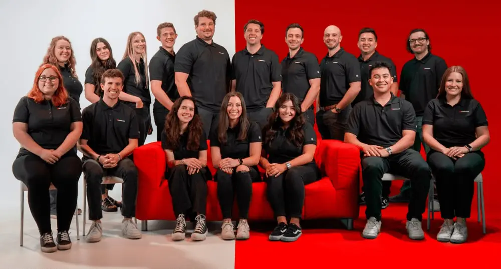


Why Big Red Jelly?
At Big Red Jelly, we believe great brands are built through strong collaboration. We work closely with our clients to understand what drives them, who they serve, and where they’re headed. Every project is guided by strategy, creativity, and purpose. Our team brings diverse experience and a shared commitment to helping brands grow with clarity and authenticity. We don’t just market your business — we help shape its future.
Let's Talk
To Elevate Your Brand & Online Experience Check Out Our Latest Articles!

Silicon Slopes Marketing: How Utah’s Tech Corridor Businesses Can Stand Out Online
Silicon Slopes generates over $30 billion in annual economic impact and hosts 1,000+ tech companies along the Wasatch Front. Here is how businesses in Utah's tech corridor can build a…


Read MoreRead More