DANDYPLANS
Brand Strategy & Visual Identity
SERVICES
- Startup Brand Strategy
- Visual Identity Design
- Messaging & Copywriting
- Social Media Strategy
Dandyplans came to us as a pre-launch startup with nothing but a vision and an amazing idea. They needed to build an entire brand from the ground up for a parental partner app that simplifies activity planning, social coordination, and interest-based discovery for kids. While the activity planning space has no shortage of competitors, none were leading with community and partnership. The challenge was crafting a brand that felt meaningfully different — warmer, more empowering, and built to genuinely connect with parents.
Execution
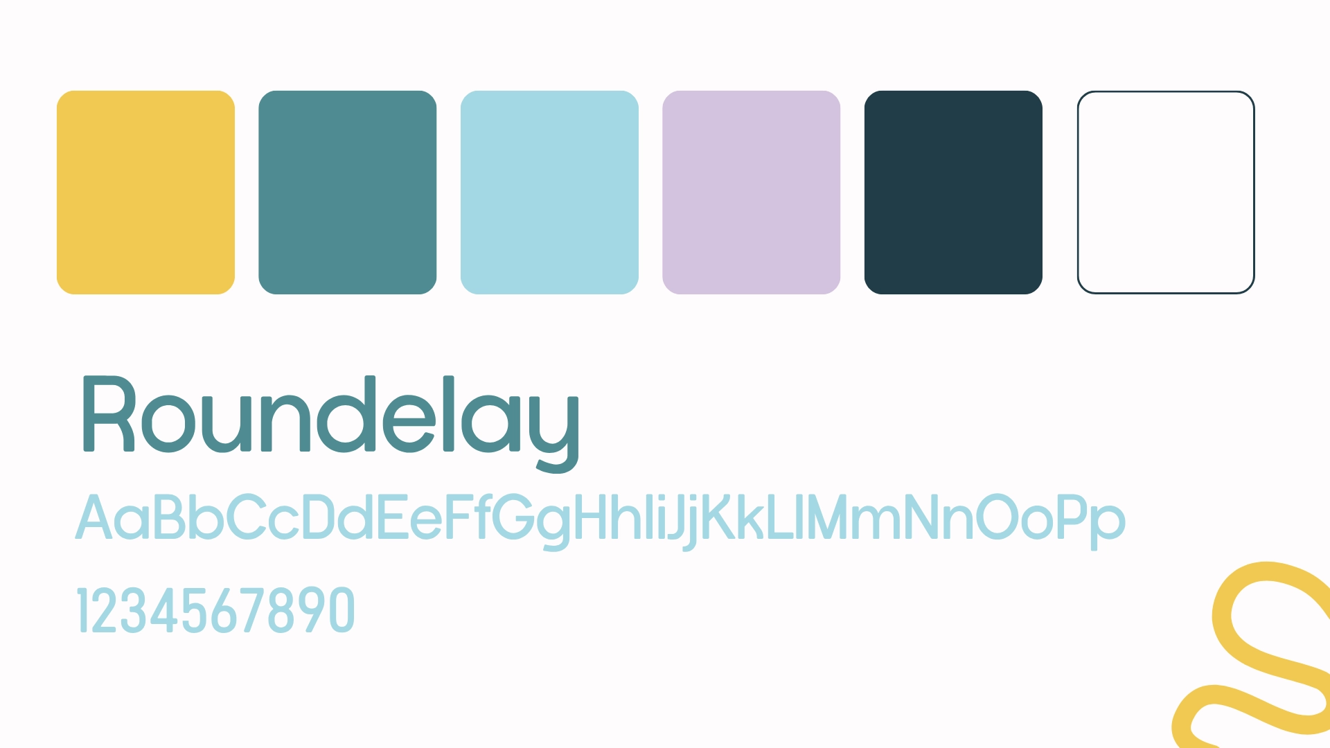
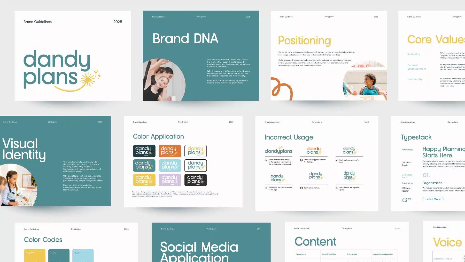
We started at the very beginning, naming, mission, core values, and messaging, then built the visual identity around that foundation with a logo, color palette, and typography that brought the brand's voice to life. To ensure the brand could live and breathe beyond the guide, we developed social media templates, a content strategy with pillars, caption direction, and a Canva asset bank for plug-and-play use. Every decision was made to position Dandyplans not just as a tool, but as a trusted partner in the chaos of modern parenthood.


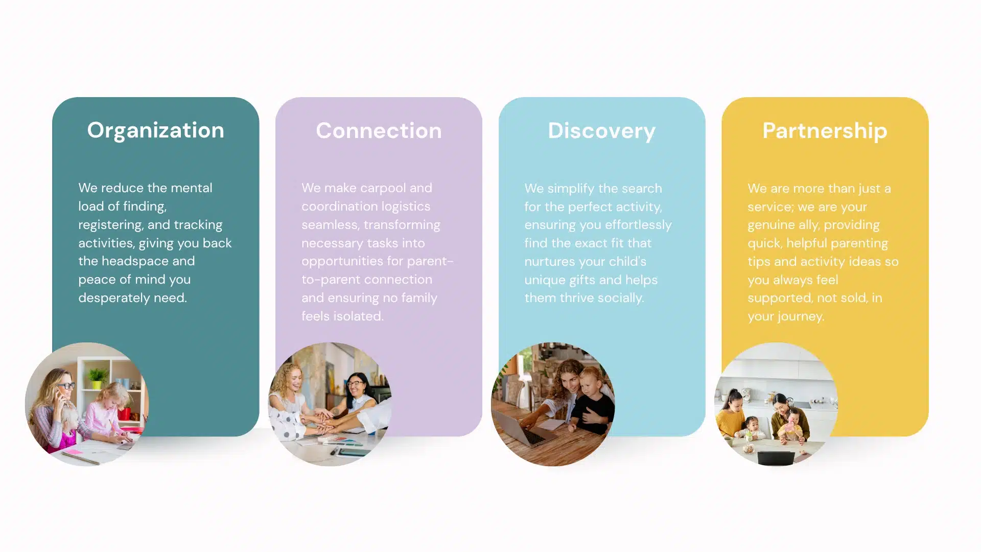
OUR MISSION
Empower parents by providing a platform that simplifies activity logistics and coordination, ensuring children are connected with opportunities that match their unique interests.
TAGLINE
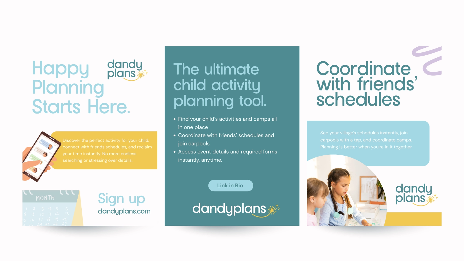
Happy Planning Starts Here.


”Dandyplans came in with a big vision and trusted us to bring it to life from scratch. The result was a brand that felt warm, intentional, and distinctly their own — one that could stand confidently in a crowded space by leading with something competitors weren't: community and parental empowerment.
Anna ThalerCreative Lead on Dandyplans
Dandyplans, Brand Strategy & Visual Identity
Creative Lead & Strategy: Anna Thaler
Messaging: Anna Thaler
Visual Identity: Anna Thaler
Social Media Strategy: Anna Thaler
Big Red Jelly, 2026