UNITED FRANCHISE GROUP
Enterprise Brand Identity
SERVICES
- Enterprise Brand Identity
- Corporate Visual System
- Logo & Mark Development
- Brand Standards & Asset Toolkit
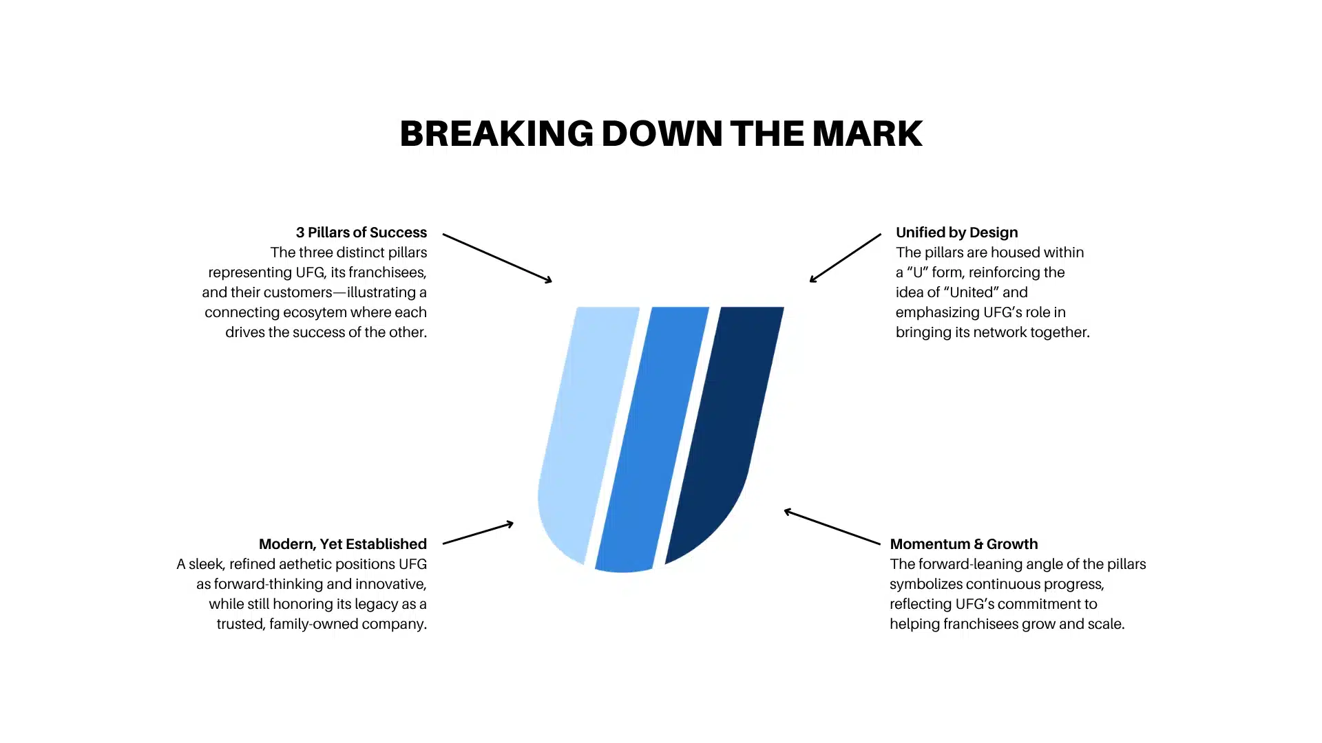
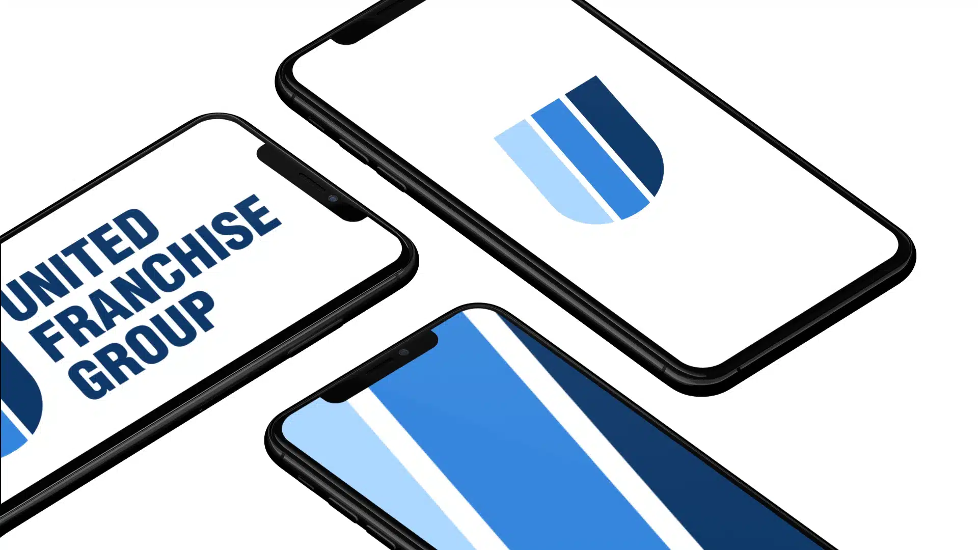
United Franchise Group, a parent company overseeing a diverse portfolio of franchise brands, was operating with an outdated identity that lacked flexibility and recognition. The existing logo was purely typographic, limiting its versatility across applications and diminishing its presence at scale. As a brand built on growth and leadership, UFG needed a modern, ownable identity system that could unify its ecosystem while standing confidently on its own.
Execution
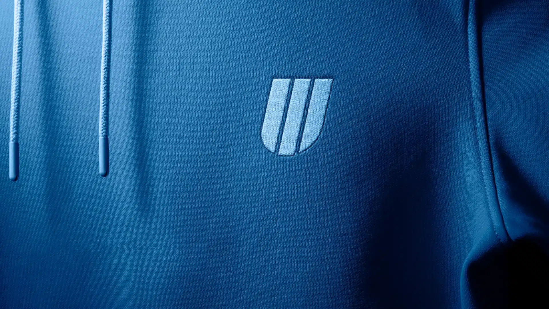
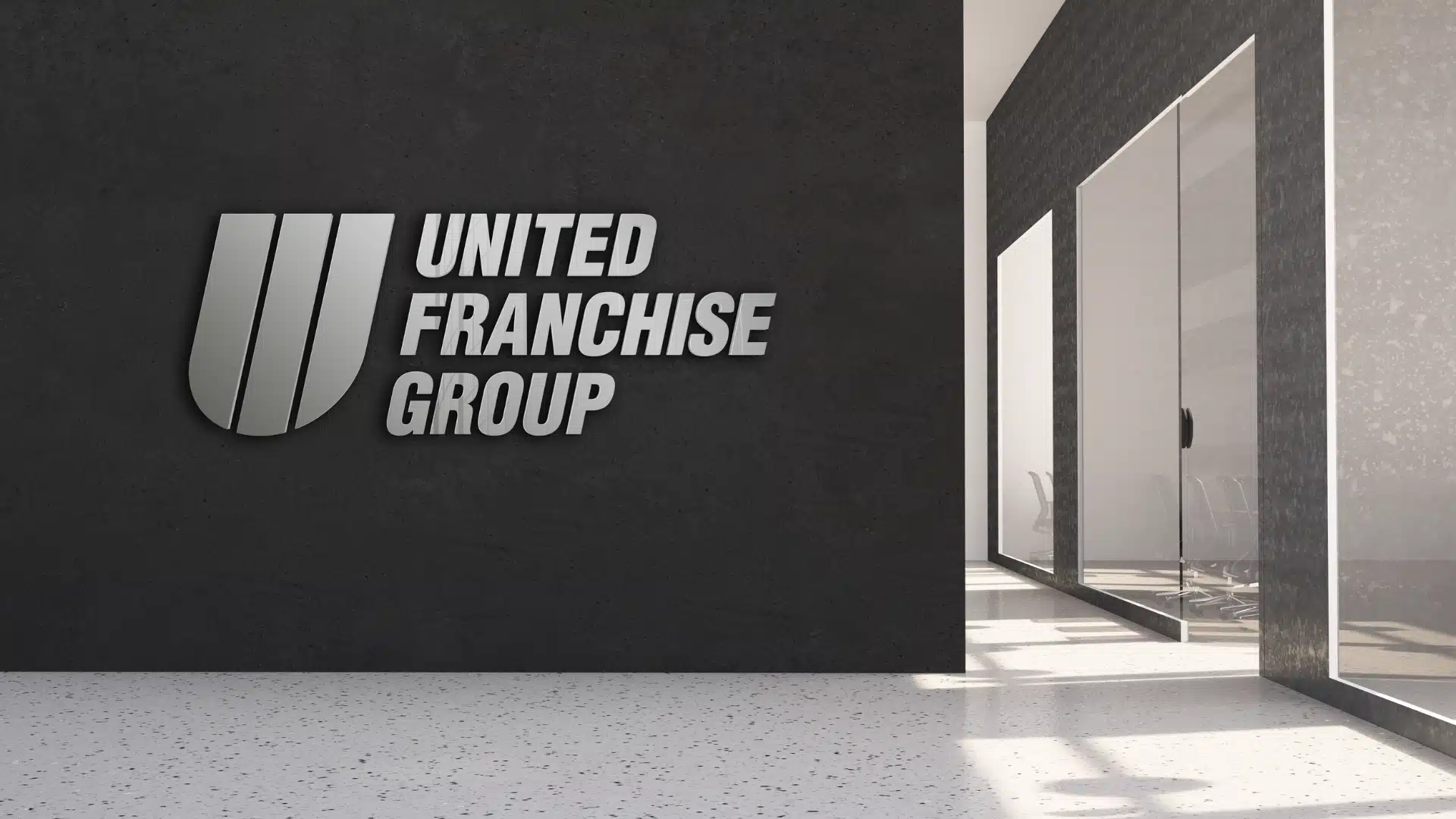
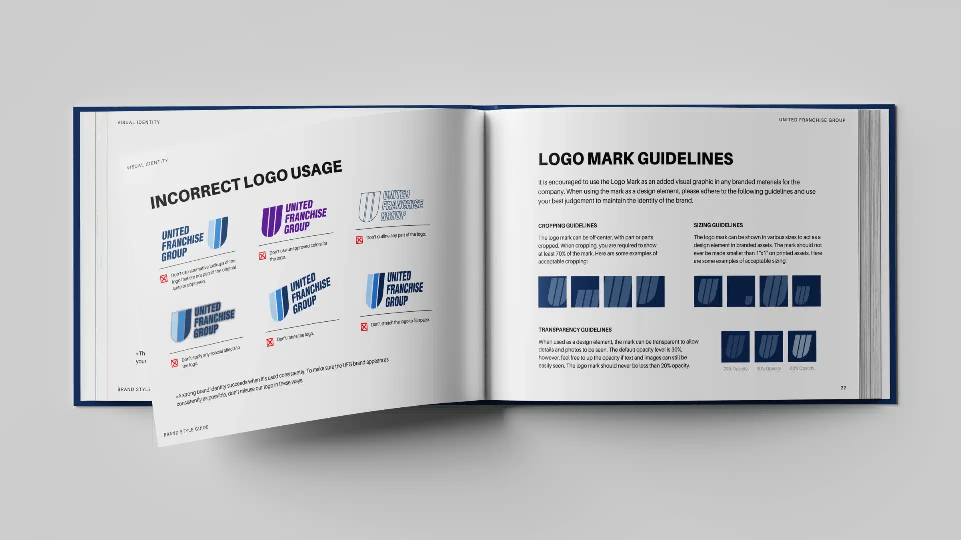
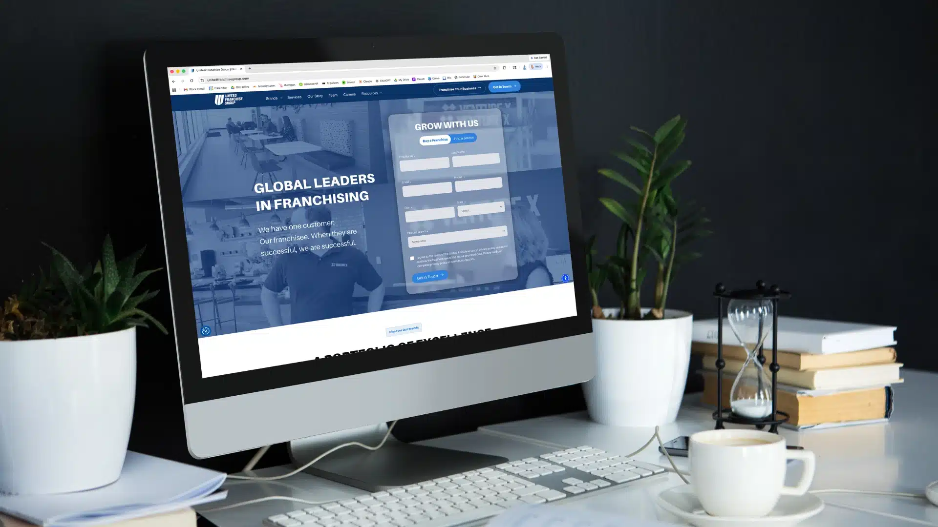
We led a full brand identity transformation, designing a distinctive mark that introduced immediate recognition and scalability across UFG’s expansive portfolio. The visual system was built to balance corporate authority with modern simplicity, establishing refined typography, a cohesive color palette, and flexible brand assets. We also expanded their messaging foundation to better support the new identity, ensuring the brand not only looked stronger, but communicated with greater clarity and confidence.
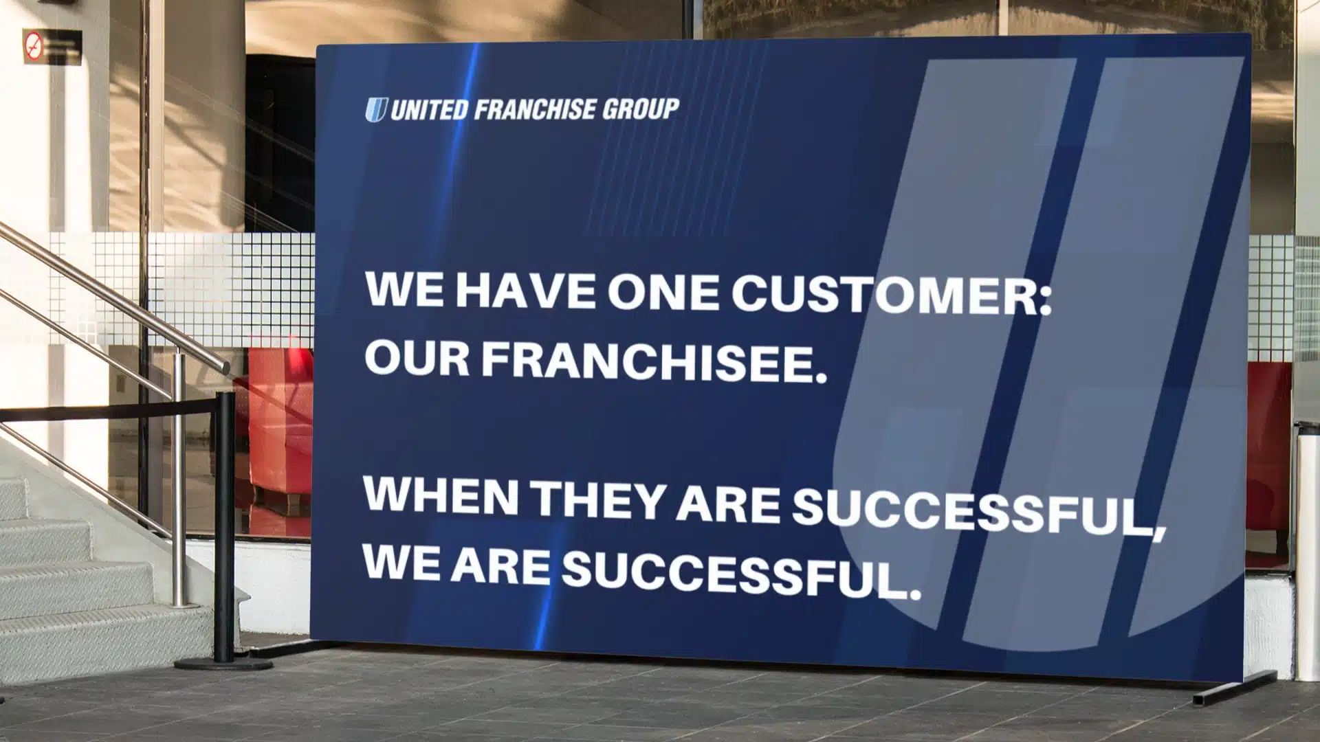
OUR MISSION
We have one customer:
Our Franchisee.
When they are successful,
We are successful.
CORE VALUES
Positive Attitude, Enthusiasm and Passion for the Company.
Keep Growing — Sales First.
Family Owned Company that is like a Family.

”Rebranding a legacy company with decades of equity is never easy, but with a clear understanding of who UFG was at its core, every decision became more intentional. That clarity allowed us to create a brand that felt not only new, but undeniably right.
Bethany BenhamCreative Lead on UFG
United Franchise Group, Enterprise Brand Identity
Creative Lead: Bethany Benham
Messaging: Bethany Benham
Visuals: Bethany Benham
Big Red Jelly, 2025