Building a Brand and Digital Home for Success: Jackie’s Classroom

Deliverables

Standard Brand, Standard Build

Platform

WordPress

Slide 1 lists elements of visual identity like logo, colors, and typography. Slide 2 displays primary brand colors: white, light blue, red, and dark blue, with color codes shown under each swatch.
A computer monitor displays a website featuring one-on-one tutoring services, with images of tutors working with students of various ages in a modern, bright setting.
A slide titled Jackies Classroom Brand Guide with educational and scientific illustrations in red and blue on the left. The slide is set against a white background with green borders.
A woman with wavy brown hair and glasses smiles at the camera. She is wearing a white shirt and an orange knit cardigan, sitting indoors with a blurred background.

Meet Jackie’s Classroom

This dedicated team of state-licensed educators has been empowering students of all ages and grade levels for years. Through one-on-one tutoring, Jackie’s Classroom fosters a supportive learning environment to cultivate academic success for each individual student

Project Level

Standard

Company Size

Small

Timeline

8 Weeks

Understanding The Problem

While Jackie’s Classroom was established and successful in its core service of one-on-one tutoring, their brand identity and marketing presence lacked the vibrancy to effectively compete in the industry. Their existing brand presentation lacked memorability and a clear message, hindering their ability to attract new tutors and connect with potential clients. This resulted in a struggle to generate enough leads for tutor expansion and missed opportunities to promote their services to both students and educators.

Screenshot of a website header for Jackies Classroom with a logo and navigation menu. Below are two sections of introductory text about meeting childrens needs and the educator’s teaching approach.

*Jackie’s Classroom before Big Red Jelly

Before Big Red Jelly

​​Jackie’s Classroom approached us seeking to elevate their brand presence and address limitations they were experiencing. Their existing brand lacked memorability and a clear message, hindering their ability to attract new tutors and connect with potential clients. This resulted in difficulty generating enough leads for tutor expansion and missed opportunities to promote their services. Recognizing the need for a stronger brand identity and a more strategic digital presence, Jackie’s Classroom partnered with us to develop a comprehensive solution.

Powerful Solutions Driven by Strategy

To address their challenges, we implemented a two-pronged approach.

The Brand

Brand Strategy and Naming

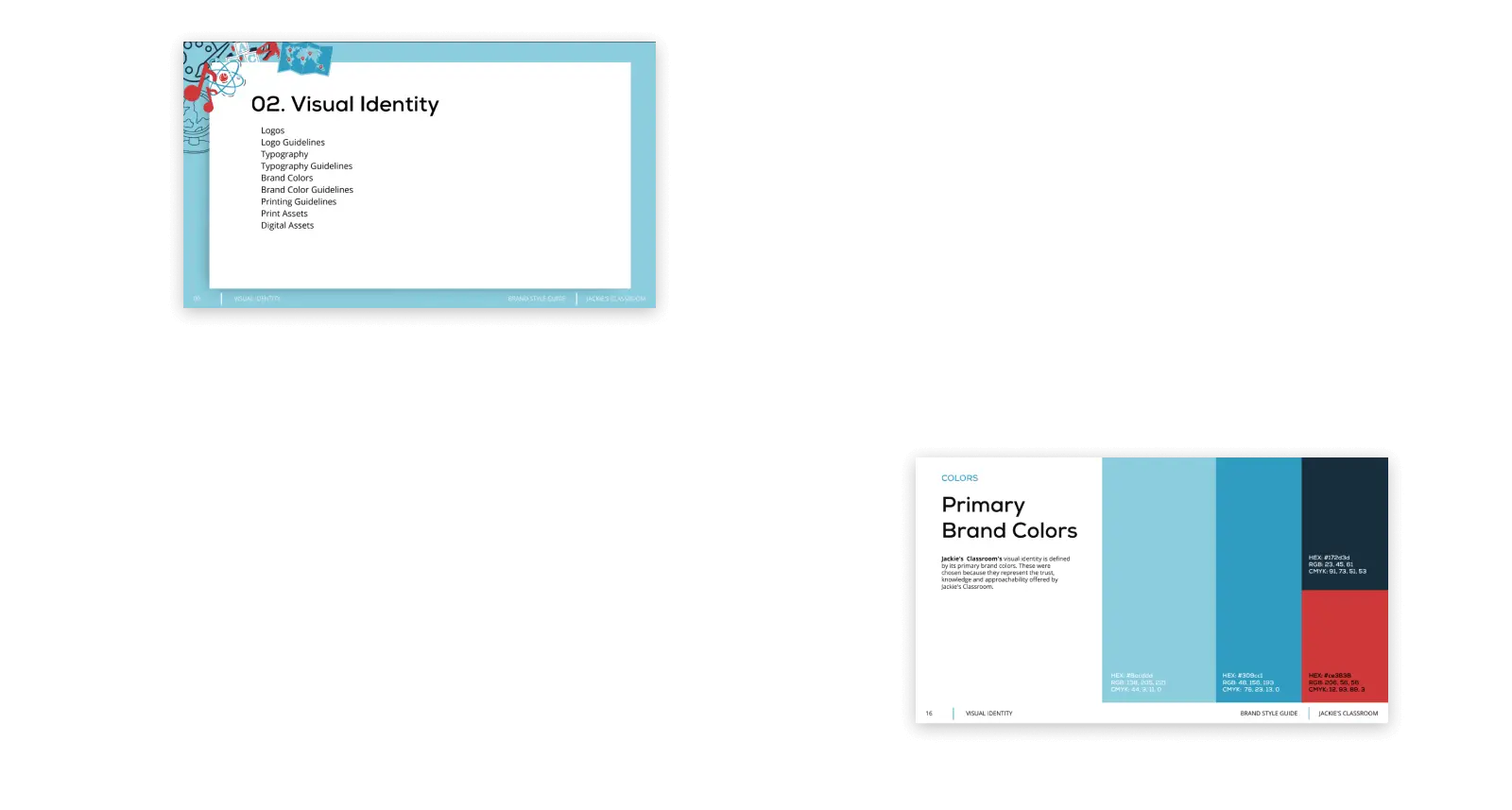
First, we crafted a comprehensive brand identity refresh, including a custom logo and color palette that conveyed professionalism, approachability, and their focus on education. Additionally, a defined typography system and strategic use of textures, graphics, and iconography enhanced the brand’s visual appeal and memorability.

Logo with overlapping blue and teal letters J and C to the left of the words JACKIES CLASSROOM in bold, dark blue uppercase text.
A bold black letter J connected to a bold black letter C on the left, with a long horizontal green rectangle extending to the right, underlined by a thin green line. The background is white.
A minimalist logo featuring the overlapping blue letters J and C with a subtle red shadow, centered on a white background.
A minimalist silver JC logo with a metallic finish appears in the bottom right corner on a plain white background.
A silver laptop, a tablet, and two smartphones display responsive educational website designs, showcasing consistent branding and layout across multiple devices.

The Website

Website Redesign

Secondly, we designed and built a new website to showcase Jackie’s Classroom’s services and expertise, attract potential students, and ensure all messaging aligned with the newly established brand identity.

Growth

Ongoing Support

Jackie’s Classroom get’s ongoing support so we can help them create more assets for their brand and support their continued growth.

A graphic with Jackie’s Classroom logo and three bullet points: Ignite a Love of Learning, One-to-one Lessons, Data Based Instruction. The design resembles a notebook with a red star in the bottom right corner.
A graphic for “Jackie’s Classroom” shows a notebook with bullet points: Ignite a Love of Learning, One-to-one Lessons, and Data Based Instruction. A blue star decorates the bottom right corner.
Logo for Jackies Classroom featuring educational icons like a pie chart, atom, DNA, abacus, and spiral notebook. Tagline reads: Driven Tutors, Successful Students. The initials JC are stylized in the center.
A blue and red JC logo is centered on a white background with abstract blue shapes. Below the logo, the text reads: Driven Tutors, Successful Students. The word Successful is in red.
Light blue background with white text in the center that reads, Expert Guidance, One Lesson at a Time. In the bottom left corner is the logo and name JC JACKIES CLASSROOM.
A white square with the text “One Lesson at a Time” in the center, surrounded by illustrations of school supplies like pencils, markers, a calculator, paper clips, and a protractor.
A white square with the text Jackies Classroom, Your Success centered, surrounded by a red, blue, and gray illustrated border. At the bottom, the Jackies Classroom logo appears.
A blue graphic with abstract shapes. In the center, white text reads, Expert Guidance, One Lesson at a Time. In the bottom left corner is the logo and name Jackies Classroom.
A graphic with a notebook design and the logo Jackies Classroom. Text lists: Ignite a Love of Learning, One-to-one Lessons, Data Based Instruction. There is a blue star in the bottom right corner.

The Results

Jackie’s Classroom’s participation at the UCTM conference following the brand refresh and website development yielded impressive results:

49
New Tutor Leads
3
Brand Awareness
2,500
In T-Shirt Pre-Orders