Pain Points
Off-brand resort aesthetic
Maze-like website
No online booking
Inconsistent brand presence
Solutions
Nostalgic brand refresh
Streamlined sitemap
Integrated online booking
Full brand activation
Tech Stack
WordPress
Online Booking Integration

Meet Strawberry Bay
Strawberry Bay is more than a marina. It is a multi-generational Utah institution that has been operating on the Strawberry Reservoir since 1984. As the only full-service marina in the area, it offers lodging, a grill, boat rentals, and year-round activities that range from summer boating to winter snowmobiling and ice fishing.
Despite being one of the top two most visited destinations in Utah alongside Lake Powell, their brand had drifted toward a “Park City” luxury aesthetic that did not match the mud-on-the-boots authenticity of the actual guest experience. Strawberry Bay came to Big Red Jelly to reclaim that identity.
They did not want a polished resort look. They wanted a brand that felt like the memory families were already coming to recreate.
Brand & Build Level
Pro
Grow Level
Pro
Industry
Hospitality & Outdoor Recreation

The Challenge: A Legacy Brand That Had Lost Its Way
Strawberry Bay’s guests are memory-makers. They are parents who grew up visiting the reservoir and are now bringing their own kids for an unplugged family experience. That story is the heart of the business, and the previous brand was not telling it.
They were missing:
- A brand that reflected the nostalgic, family-owned spirit of the marina
- Clear audience psychographics to guide messaging
- A competitive position against regional resorts
- A streamlined, mobile-first website built for rural guests
- Real online booking for cabins, rentals, and the grill
- Consistent brand presence across digital, print, and physical merchandise
The Solution: A Nostalgic Brand System on a High-Tech Engine
Big Red Jelly ran our Proven Process across Brand, Content, Build, and Rollout. Anna Thaler led the repositioning, and Stephen Sobisky engineered the digital infrastructure. The goal was to put a rustic, hand-crafted brand on a modern, high-performance website so Strawberry Bay could compete with larger regional resorts without losing the local gem feel their loyal customers love.


Part 01 | Research & Positioning
Finding the Heart Behind the Generic Resort Facade
Anna Thaler ran an intensive research phase, layering audience psychographics on top of the client’s existing demographic data, and auditing seven major regional competitors including Deer Creek, Jordanelle, and Flaming Gorge.
Our work included:
- Audience psychographics centered on the Memory-Maker parent who wants to recreate their childhood trips
- Competitor analysis across seven regional destinations
- Positioning as the only full-service ecosystem where guests can dine, sleep, rent, and repair in one remote, beautiful setting
- Caregiver and Explorer brand archetypes to guide future growth
Part 02 | Messaging & Brand Voice
A Friendly Neighbor With Serious Expertise
We defined a brand voice that is welcoming and approachable, yet confidently credible. Strawberry Bay should sound like a neighbor who knows where all the best fishing spots are, not a corporate resort chain.
Deliverables:
- The tagline “Make every season unforgettable,” a double-entendre covering year-round versatility and the seasons of a family’s life
- Three core Unique Value Propositions: Family Owned & Operated, Effortless Convenience, and Authentic Outdoors
- A messaging framework that positions the lack of “Park City polish” as a feature, not a bug


Part 03 | Visual Identity
A Patch Emblem Built for Nostalgia
We moved from a modern, sterile “SB” logo to a patch emblem that feels like it belongs on a vintage hat or a scout uniform.
Key upgrades included:
- A patch-style logo designed to trigger nostalgia on merchandise and signage
- Custom patterns featuring strawberries, fish, and water ripples
- Muted textures that give digital and print assets a hand-crafted feel
- Fonts that are bubbly yet traditional, honoring the 1984 heritage while staying clean on mobile
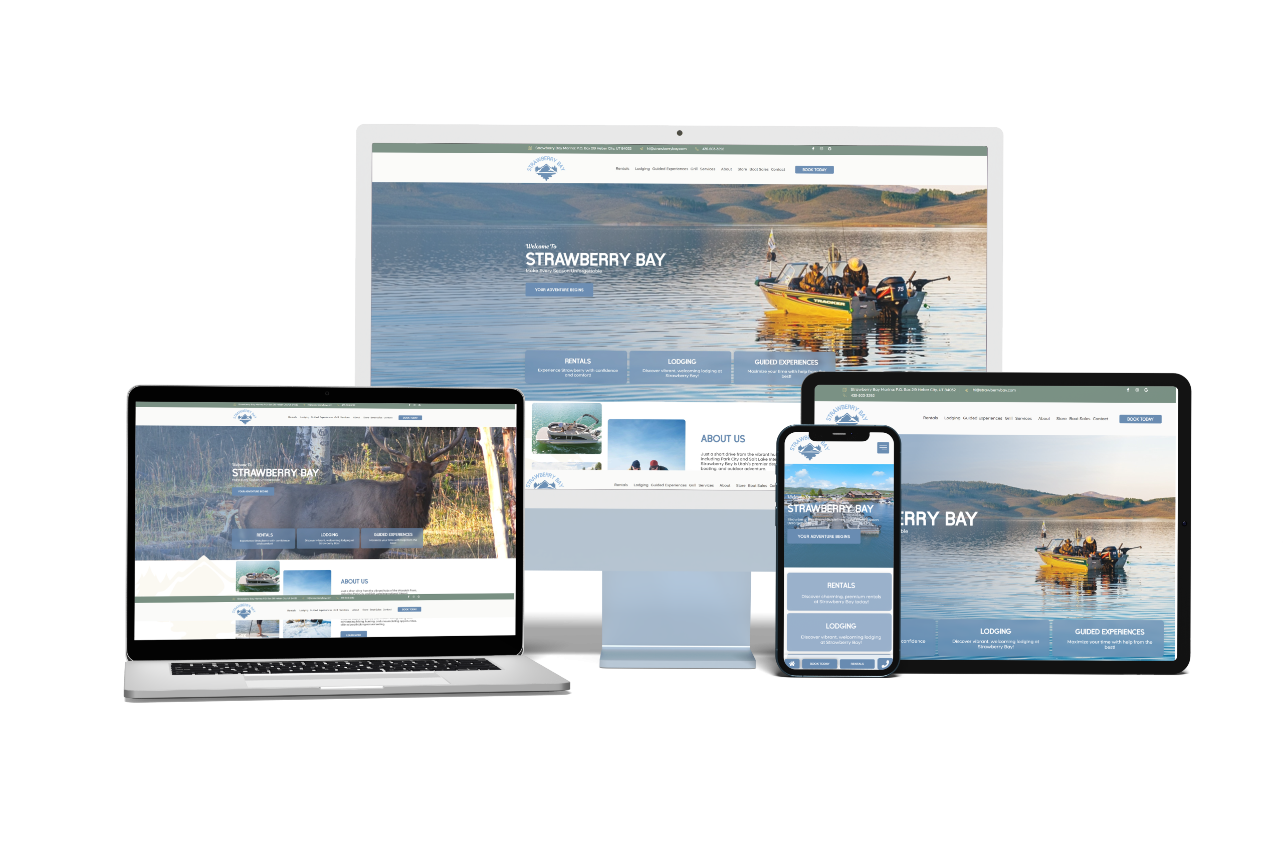
Part 04 | Website Build
Modernizing the Digital Frontier
Stephen Sobisky and the development team took the rustic brand and built it into a high-tech engine.
Key upgrades included:
- A simplified sitemap focused on Lodging, Rentals, and The Grill
- Online booking integration so families can plan their entire trip in a single session
- A mobile-first, performance-optimized build for guests on rural cell service
- Bold, accessible CTAs like “Book Your Season” that pop against the nostalgic palette


Part 05 | Brand Activation & Rollout
Consistency Across the Marina
Our Rollout Phase brings the brand to every corner of the guest experience.
Deliverables:
- Custom merchandise including hats, koozies, and water bottles that turn guests into walking billboards
- “Leave Behind” cards in each lodging unit with Wi-Fi details and a 15% grill discount
- Social media and email templates for a consistent identity across channels
- Print collateral including seasonal flyers, owner business cards, and a playful “Gone Fishing” sign
Bring It All Together
Strawberry Bay now has the digital infrastructure to compete with large regional resorts while keeping the local gem feel their loyal customers love.
Nostalgic Brand
A patch emblem and hand-crafted visual system that honor the 1984 heritage of the marina.
Strategic Tools
Integrated online booking for cabins, rentals, and the grill in a single session.
Marketing Support
A complete rollout kit across merchandise, email, social, and on-site collateral keeps the brand consistent across every touchpoint.
100
%
100% visual consistency achieved across lodge, grill, and marina assets.
3
A 3-click path from landing page to a completed rental or lodging booking.
7
7 regional competitors analyzed to find Strawberry Bay's unique full-service positioning.
The Conclusion: Professionalism Meets Hometown Warmth
By leveraging nostalgia as a psychological driver and consistency as a professional anchor, Big Red Jelly gave Strawberry Bay a brand that is truly unforgettable. The marina now has the digital infrastructure to compete at the regional level and the hand-crafted identity to keep its hometown soul.
40
40+ years serving families on the Strawberry Reservoir since 1984
2
2 brand archetypes (Caregiver and Explorer) guiding future growth
4
4 full phases of the Proven Process delivered across Brand, Content, Build, and Rollout

Shown: Stephen Sobisky & Anna Thaler
The Strategists
Anna Thaler | Brand
“Strawberry Bay did not need a Park City makeover. It needed someone to pull the nostalgia back to the surface. Our job was to give families a brand that felt like the memory they were already coming to recreate, and to back it up with the professionalism a modern marina deserves.”
Stephen Sobisky | Build
“A marina website has to work on a spotty cell signal with a family in the parking lot trying to book a cabin. Every performance decision and every CTA was about getting that guest from curious to booked in as few taps as possible.”
Let's Talk
Your New Hospitality Growth Partner
Big Red Jelly is more than a marketing agency. We are growth strategists for ambitious brands. We work with companies ready to level up, align their identity, and scale with intention. Through strategy, design, and digital execution, we transform scattered efforts into focused momentum. Our team brings cross-industry experience and a problem-solving mindset to every engagement. We don’t just launch campaigns. We build brands designed to last.
Meet the Team


Why Big Red Jelly?
At Big Red Jelly, we believe great brands are built through strong collaboration. We work closely with our clients to understand what drives them, who they serve, and where they’re headed. Every project is guided by strategy, creativity, and purpose. Our team brings diverse experience and a shared commitment to helping brands grow with clarity and authenticity. We don’t just market your business — we help shape its future.
Let's Talk
To Elevate Your Brand & Online Experience Check Out Our Latest Articles!
Big Red Jelly Press Release
Top branding digital agencies combine strategy, design, and digital execution — not just logo design. Here are 6 criteria to evaluate any agency partner.


Read MoreRead More