
Pain Points
Look-Alike Competitors
No Visual Symbol
Name Legibility Issue
Shame-Driven Audience
Complex Compliance Needs
Solutions
Dark, Elevated Rebrand
Custom Symbol Mark
Quiet Fighter Positioning
AI-Readable Brand Guide
HIPAA-Compliant Build
Deliverables
New Logo & Brand Guide
Custom Typography System
Compliant Checkout Flow
Product Catalog


Meet ThinGevity
ThinGevity is a sister company to Jace Medical, a licensed online pharmacy, founded by one of Jace’s own co-founders to capitalize on the fast-growing GLP-1 and peptide weight loss trend, but with a different philosophy. Most companies in the category chase fast results. ThinGevity’s whole premise is that losing weight the wrong way, without protecting muscle mass, just leaves people worse off once the weight comes back. The name itself is deliberate wordplay: thin, for weight loss, and gevity, for longevity, being healthy for longer, not just lighter for a while.
Brand Level
Standard
Build Level
Pro
Industry
DTC Health & Wellness

The Challenge: Every Competitor Wore the Same White Coat
Every major player in the category had settled into the same look: a lowercase serif word mark, a white background, a photo of someone injecting a needle in their leg on the other side, and a headline promising to lose weight fast. No symbol, no color story, nothing to actually tell one brand from the next. On top of that, ThinGevity’s own name carried a hidden legibility problem: written all lowercase, it could easily be misread as “thing evity” instead of the intended “thin” plus “gevity.”
What ThinGevity Was Missing:
- A visual identity that didn’t look identical to every other DTC weight loss brand
- A symbol or mark, something none of its competitors had
- A name that read correctly at a glance, without a double take
- Messaging that spoke to a genuinely reluctant, shame-carrying audience without judgment
- A website built to handle real medical intake and compliance, not just a storefront
The Solution: Find the Gap, Then Own It
The brief was simple to state and hard to execute: figure out exactly what every competitor had in common, then do the opposite, speak directly to the people the category was failing, and build a site that could actually handle the compliance a healthcare product demands.
Our Focus Areas:
- Identify precisely what made every competitor’s brand interchangeable
- Build a dark, elevated identity where the category default was all white
- Speak directly to a reluctant, self-aware audience without judgment
- Design a mark from the brand’s own name instead of leaving that space empty
- Build a HIPAA-compliant site with per-product medical intake, not a generic storefront


Part 01: Finding the Gap No One Else Had Filled
Mapping Out Exactly What Made Every Competitor Look the Same
Before designing anything, brand strategist Joshua Lee took screenshots of six or seven competitor homepages, Ro, Hims, Hers, and Skinny Rx among them, and put them all on a single slide to show the client directly. The pattern was impossible to miss: every one used a lowercase serif word mark, a white background, and a needle-in-the-leg photo, all saying some version of “lose weight fast.” Once that sameness was visible in one place, the direction became obvious.
What we developed:
- A side-by-side competitive audit laying out the shared visual language across the entire category
- A clear mandate to build the opposite of what every competitor had already done
- A specific goal to identify and fill a real gap, not just look different for its own sake
Part 02: Speaking to “The Quiet Fighter”
Building a Brand Around Shame, Not Around Shortcuts
The people ThinGevity actually needed to reach weren’t loud about wanting to change. As Joshua Lee described them, “they’re silently striving to be better. They’re aspirational, they’re not trying to stay in the same spot,” even while carrying real shame about needing outside help in the first place. That insight shaped the brand’s guiding idea: reclamation, reclaiming your life and your health from modern ailments working against both, positioned as a counterbalance rather than a quick fix.
What we developed:
- A named audience persona, “the quiet fighter,” built around real psychological insight rather than a generic customer profile
- A guiding idea, reclamation, that reframed the service as restoring long-term health rather than chasing a fast result
- A tone built to support without judgment, instead of selling urgency or shame


Part 03: Turning a Name Problem Into a Logo
Solving a Legibility Issue and a Symbol Problem at Once
Written all lowercase, the name read ambiguously, easy to misread as “thing evity” instead of the intended “thin” plus “gevity.” Capitalizing the G solved that on its own. From there, the team took that same capital G from the brand’s chosen typeface, duplicated it, mirrored it, and flipped it into an abstract, symmetrical mark tied directly to the reclamation idea: transformation, a new start. The typography itself got the same close attention, the “I” was adjusted to match the other letters’ height, and the T and I were combined to close an awkward gap, leaving the G as the only letter that pops up, appropriately.
What we developed:
- A capitalized G that fixed the brand name’s legibility problem
- A custom symbol built directly from the brand’s own wordmark, tied to the reclamation theme
- A custom-adjusted typeface, with letterforms modified for consistency and a cleaner mark
- An interactive brand guide built to be machine-readable, so an AI tool can check new content against it for on-brand consistency
Part 04: Going Dark Where Everyone Else Went White
Choosing a “Chanel Route” in a Category Built on White Backgrounds
Every competitor’s site ran on a white background. ThinGevity went the opposite direction on purpose: black as the primary color, black-and-white photography, and a sophisticated, elevated feel the team described internally as “a Chanel route.” To address the word “thin” sitting inside the name, the typography and line work went deliberately thin and delicate throughout, balanced with a single orange accent color for a small, controlled pop against all that black and white.
What we developed:
- A black-first color system built specifically to invert the category standard
- Black-and-white photography chosen for a sophisticated, elevated feel over a clinical one
- A thin, delicate typography and line-work system reflecting the brand name itself
- A single orange accent color, used deliberately and sparingly against the darker palette


Part 05: Building a Website That Can Actually Handle Medicine
Compliance First, Storefront Second
ThinGevity isn’t selling a typical consumer product, it’s handling real medical intake for prescription-adjacent treatments, which means the website had to be built to a different standard than a normal e-commerce site. The build needed HIPAA-compliant infrastructure, product-specific medical intake forms routed to a licensed medical partner, and a full e-commerce flow, 20 product SKUs, shipping, tracking, and order confirmation, on top of it.
What we developed:
- A HIPAA-compliant website built on WordPress with a dedicated compliance data flow
- Per-product intake forms routed directly to ThinGevity’s medical review partner
- A full e-commerce build spanning 20 SKUs, shipping, tracking, and order confirmation
Bring It All Together
ThinGevity went from a brand that could have been mistaken for any of its competitors to the one company in its category that actually looks different, speaks to its audience without judgment, and quietly runs a website built to handle real medical compliance underneath all of it.

The Only Dark Brand in an All-White Category
A visual identity that inverts the industry’s shared look on purpose.
Built Around a Real Person, Not a Persona Template
Messaging shaped around the quiet fighter, not a generic customer profile.
Compliant by Design, Not by Accident
A HIPAA-compliant checkout built for real medical intake, not just a storefront.
The Conclusion: Different Wins When Everyone Else Looks the Same
In a category where every brand had converged on the same look, being different wasn’t a risk, it was the whole strategy. ThinGevity’s brand stands out precisely because it refused to blend in with a field that had already agreed, without ever discussing it, to look identical.
6
Competitor homepages mapped out on a single slide before any design work began
20
Product SKUs built into ThinGevity's HIPAA-compliant e-commerce flow
1
Custom symbol mark, where every competitor in the category has none

Shown: Joshua Lee & Stephen Sobisky
The Strategists
Joshua Lee | Brand
“They’re silently striving to be better. They’re aspirational, they’re not trying to stay in the same spot.”
Let's Talk
Big Red Jelly: Your Brand Growth Partner
Big Red Jelly builds brands that grow. We blend strategy, design, and systems to help companies scale with purpose, translating what makes a business genuinely different into a brand people trust. Ready to see what a rebrand could do for your company?
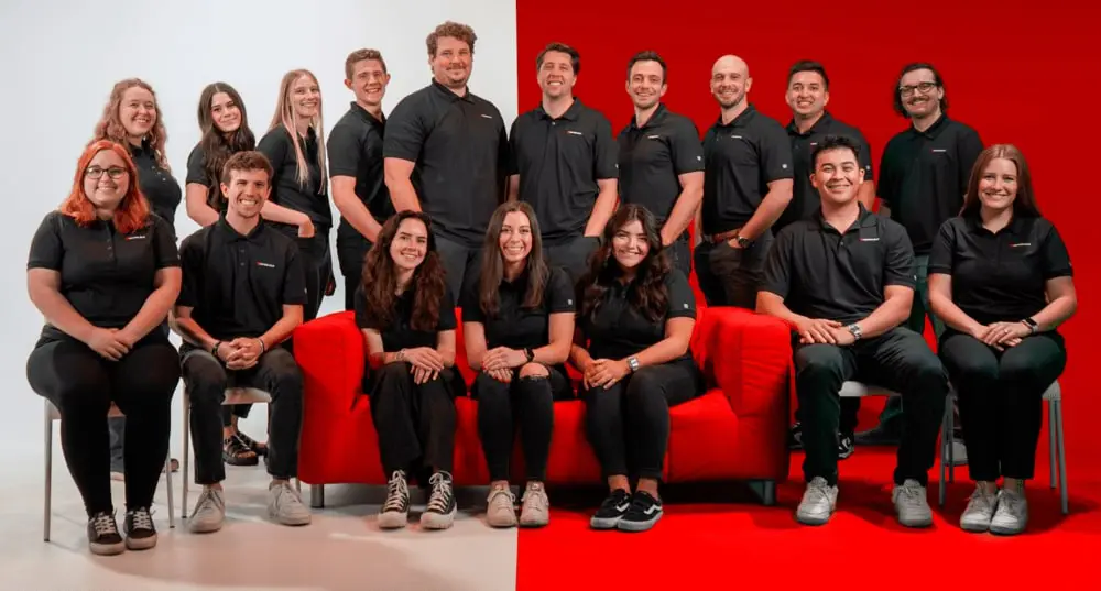
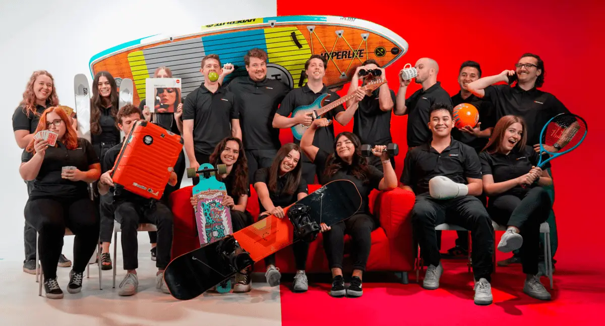
Meet the Team






Why Big Red Jelly?
At Big Red Jelly, we understand that branding is more than aesthetics, and that it’s how your organization communicates value, builds trust, and drives growth. For Utah Partners for Health, that meant creating a brand that could serve multiple audiences while staying true to a deeply important mission. We combine research, strategy, and creativity to deliver brands that look better and work better.
Let's Talk
To Elevate Your Brand & Online Experience Check Out Our Latest Articles!
The Current Behind Your Growth: The Brand Story of Thalassa
Big Red Jelly’s brand strategist shares the story behind Thalassa — our new AI service — from the name and logo to the colors and who it’s built for.

Read MoreRead More