Ready to level up your brand’s visual identity? Your brand’s visual identity directly influences consumer perception, shaping how customers interpret and connect with your business. Let’s break down exactly how you can sharpen your brand’s look and feel. The goal is simple: build trust, increase brand recognition, foster brand trust, attract more customers, keep them coming back, and grow your bottom line.
Defining Brand Visual Identity in Your Brand Strategy
First things first—what do we actually mean by visual identity? Brand identity refers to the combination of visual and symbolic elements that represent your brand. Here’s how I see it: your brand’s visual identity is how you use visuals to show what your business does, how you do it, and what makes you stand out. Brand elements and visual elements—such as logos, colors, typography, and imagery—are the building blocks of a brand’s visual identity.
Components and Visual Elements of Visual Identity (It’s More Than Just a Logo)
Your logo is the obvious starting point, but it’s just one piece of the puzzle. A brand’s visual identity is made up of key elements and design elements that work together to create a recognizable and cohesive look. Your visual identity is really a full toolkit, including things like:
- Your color palette, color palettes, brand colors, and typography (fonts), which are essential for conveying brand personality.
- Your photos and videos.
- Graphics, icons, and textures.
- Graphic elements that support consistent branding across materials.
- Other visual elements (like icons, patterns, and layout components) that help create a cohesive and impactful identity.
- The overall aesthetic of your marketing materials and pitch decks.
- Print materials for your office, trade shows, and expos.
- In-store branding, like menus, signage, and decorations.
- Your merchandise, business cards, and email signatures.
When you stop and think about it, there are so many ways you’re already communicating visually with your customers—probably more than you realize! All these components work together to form the overall visual identity of your brand.
The Power of Visual Communication
We’re all visual creatures. Just like we eat with our eyes first at a restaurant, we also buy with our eyes first when it comes to business.
So, how does your brand actually look? What do people feel when they see your business card or flyer? These visual cues play a crucial role in shaping your brand image and communicating your visual language to customers, influencing how your brand is perceived and remembered. Is your message clear and easy to get? Does it make someone want to take action and buy from you?
Your visual identity is a big deal, and it’s about way more than just your logo. Let’s talk about why it matters, and then I’ll walk you through five practical steps you can use to make it even better.
Why Visual Identity is Important
You’d be surprised how often people interact with your brand’s visuals—on delivery trucks, flyers, your website, and even your Google Business profile (which they’ll probably see before they ever call you). That’s why it’s so important to know exactly what your visuals are saying about your business. Having a distinct visual identity and maintaining brand consistency ensures that every touchpoint reinforces your brand and makes it easily recognizable.
Your brand’s visual identity is a direct reflection of your brand’s identity and communicates your values to customers, helping to build trust and strengthen your overall brand perception.
1. Builds Trust and Consistency
A strong visual identity builds trust and keeps things consistent. A consistent visual identity across all channels is essential for building brand trust, as it helps maintain consistency in every customer interaction and touchpoint. If your website uses low-quality stock photos, people will wonder if you’re legit. If your logo looks different on your polo shirt, business card, and website, customers might not even realize it’s the same company. Consistency builds trust, and trust leads to more sales.
Real-World Example: Consider a major bank. Every branch, every credit card, every piece of direct mail, and every mobile app screen uses the exact same shade of blue and the same typeface. This unbroken consistency tells the customer: “We are stable, legitimate, and reliable.”
2. Helps You Stand Out and Differentiate
Your visual identity is what helps you stand out from the crowd. It’s a shame when small businesses just copy big brands’ logos, fonts, and styles—it only makes you blend in, not stand out. Establishing a strong brand stand through a distinct visual identity is essential, and effective brand positioning plays a key role in market differentiation and shaping customer perception.
Sure, there are some basics in brand design—like greens and blues for wellness, reds and yellows for fast food—but the real magic happens when you find a way to be different.
Real-World Example: In the highly saturated coffee market, most brands use dark browns or muted colors. A brand like Starbucks introduced vibrant greens early on to signify freshness and nature, immediately carving out a visually unique space. Using unique visual elements like distinctive logos, thoughtful typography, and strategic color choices can make a brand memorable and reinforce brand recognition. Conversely, a local coffee shop could differentiate by using hand-drawn graphics and recycled paper textures to convey a handcrafted, local feel that a large chain simply can’t replicate.
3. Provides Internal Clarity for Employees
A clear visual identity isn’t just for your customers—it’s for your team, too. Without some guidelines, your sales, marketing, and customer service folks will all end up using different pitch decks, email templates, and social posts. That leads to confusion and a lot of, “Wait, how should this look?”
Having your visual identity documented through detailed brand guidelines, a comprehensive brand style guide, and a structured visual identity system ensures everyone is on the same page. Clear brand guidelines help teams maintain consistency and clarity, keeping your brand looking sharp everywhere.
4. Increases Conversion, Brand Recall, and Brand Recognition
On a practical note, a simple, clear, and good-looking website will boost your conversion rates. People will stick around longer, and your brand will be easier to remember. When your visuals are memorable, customers are way more likely to come back when they need you again. A strong visual identity makes a brand instantly recognizable, helping to increase brand awareness and ensuring your business stands out even without explicit logos or branding cues.
Real-World Example: A clear visual identity guides users. Recognizable brands use consistent visual cues—like always using the same accent color for the primary call-to-action button (say, a vibrant red)—to drive brand recall. Users learn to recognize that color as the signal to purchase or sign up. This predictable design pattern, driven by your visual identity, makes transactions faster and increases the likelihood of a sale.
Five Practical Steps to Improve Your Visual Identity
Creating an effective brand identity is a strategic process that involves careful planning and execution to ensure your brand stands out and communicates its values clearly. The following steps will guide you through the process of brand identity creating.
Let’s jump into five practical tips you can start using today to make your brand’s visual identity even better.
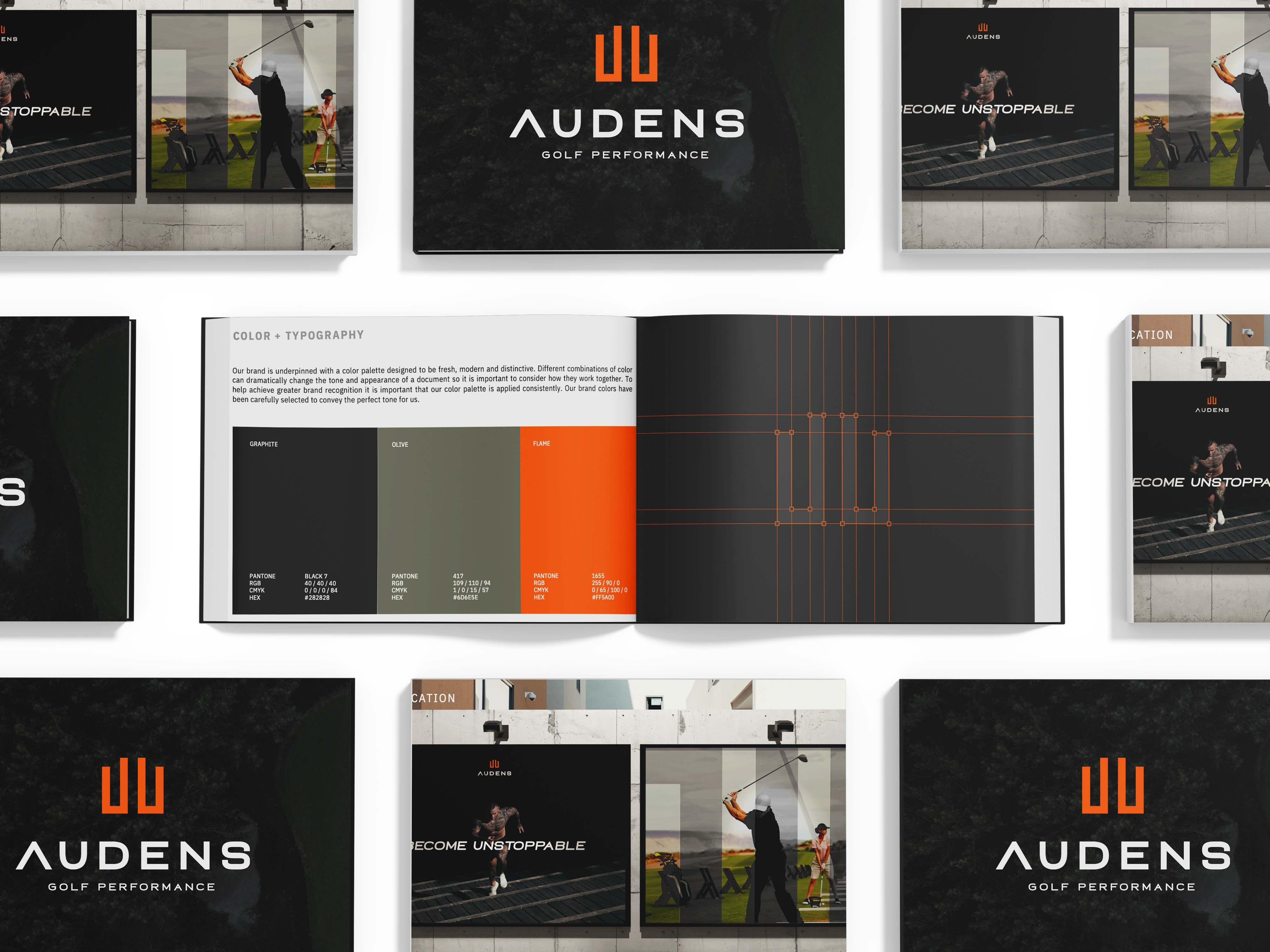
Tip 1: Consistency Above All Else
If you remember just one thing, make it this: consistency is everything. Maintaining a consistent brand identity across all channels is crucial for building brand equity, recognition, and trust. Implementing a cohesive visual system—covering elements like typography, color, and layout—ensures your branding remains visually consistent and recognizable at every touchpoint.
Your design should make this easy. If your logo is too detailed, it’ll just look like a blob when you try to put it on a polo shirt. Keep it simple! Simple designs work everywhere, and that’s what helps you stay consistent and build the trust that leads to sales.
- **Color tip: Don’t go overboard with colors. Stick to a simple palette—**a base color (like off-white or gray), one accent color for calls to action, and maybe a secondary accent for support. If you want to add more, do it carefully.
Real-World Example: A brand like Coca-Cola is the gold standard of consistency. That specific shade of red is instantly recognizable globally, whether on a tiny can, a billboard, or a massive delivery truck. They don’t switch to orange for a summer campaign; they maintain that core visual identity everywhere.
Tip 2: Be Different, Not Just Better
It’s actually easier (and way more effective) to be different than to try to be “better”—because “better” is so subjective. If you’re a startup or small business, lean into what makes you unique: Let your brand personality and brand’s values shine through your visual identity to create a consistent and authentic presence.
- Highlight your geographic area, a fun mascot, or your family-owned status.
- Don’t try to copy the big guys. Being a small business is actually your superpower—your customers might get to talk directly to the owner! That’s something Amazon or Walmart just can’t offer.
Real-World Example: A small, family-owned bakery shouldn’t use the sterile, minimalist design of a massive national chain. Instead, they should embrace the organic, natural human elements. They could use handwritten fonts, warm, nostalgic photography, and imperfect textures to visually communicate: “We are small, we are authentic, and we care.“ This difference creates a powerful emotional connection. The bakery’s visual identity reflects its core values and brand’s purpose, showing a commitment to community, authenticity, and quality.
Tip 3: Brand All Customer Journey Touch Points
Grab a whiteboard or a piece of paper and map out your whole customer journey. You’ll see exactly what your customers experience—and you’ll spot all kinds of places where you can add your brand’s magic touch. Mapping the customer journey also helps you meet customer expectations and ensures you connect with your target customers and target audience at every stage.
- B2C Example (Restaurant): This includes everything from the look of the Google Maps listing, the external building signage, the menu design, the tabletop surface, the check-out screen, to the follow-up text message offering a loyalty discount. Each branding touchpoint can attract potential customers and foster loyal customers, ultimately building brand loyalty.
- B2B Example (Agency): This means branding your intake forms (using Typeform with your visuals instead of a plain Google Doc), welcome videos, milestone emails, client onboarding presentations, and even the physical client happiness box you mail out. These touchpoints not only appeal to potential customers but also nurture loyal customers, strengthening brand loyalty.
Branding every touch point keeps things consistent, delights your customers, and helps them remember where they are in your process. And as always, all of this builds trust.
Tip 4: Roll Out Your Brand Internally
A great visual identity is only half the battle—you’ve got to roll it out to your team, too. Sit down with your marketing, sales, and leadership teams and walk them through it together. This internal rollout should align with your overall marketing strategy, business strategy, and brand strategy to ensure consistency and support long-term growth. Coordinated marketing efforts help reinforce the brand both internally and externally.
- Share the story behind your logo and why your colors were chosen.
- Clarify which fonts to use for headers, sub-heads, and body paragraphs.
You’ve already put in the hard work, so make sure your team is on board and moving in the same direction. I recommend doing this once or twice a year to keep your brand story fresh and make sure everyone’s using it the right way.
Real-World Example: An appliance repair company needs its repair technicians to embody the brand. Rolling out the brand internally means every tech gets a training session showing them that the branded polo, the logo on the service van, and the design of the invoice they leave behind are all part of one consistent promise to the customer. This prevents one tech from using an old invoice design while another uses a new one.
Tip 5: Release the Brand, Don’t Police the Brand
Finally, let your brand out into the world—don’t just police it. Consistency matters, but your style guide shouldn’t just be a list of “don’ts” for your team.
Instead, use your internal rollout to show your team what’s possible. Give them the freedom to get creative and try new things—sometimes bending the rules leads to the best ideas.
- Your guide should help your team get creative and do more—not just act as a rulebook.
- Focus on showing examples of what your visual identity can do, and how non visual elements like brand voice and verbal identity contribute to your brand’s personality, instead of getting too specific about what not to do.
- Include guidelines for verbal identity and brand voice to ensure your messaging is consistent and authentic across all channels, including social media posts.
- Remember, non visual elements are just as important as visuals in expressing your brand, especially in written and spoken communication.
Real-World Example: Imagine a technology company’s style guide says: “Only use clean, professional photography.” If a clever social media manager wants to run a fun, unique campaign using intentionally grainy, 90s-style photos to reference a retro trend, the brand should have enough underlying principles to allow for this creative flexibility. Managing brand assets like logos, colors, and images ensures that even creative campaigns on social media posts stay on-brand and cohesive. The focus is on the spirit of the brand, not just the rigid letter of the law.
Conclusion
Visual identity can feel like a lot, but it’s actually pretty fun! If you stick to these five basics—be consistent, be different, brand every touch point, roll it out to your team, and let it grow—your brand will come alive and your bottom line will thank you.