
Pain Points
Look-Alike Branding
Overwhelming Feature Set
Untold Strengths
Hesitant Leadership
Solutions
Competitor-Driven Rebrand
Bold Color Break
Mega Menu Build
Scoped Launch Plan
Deliverables
New Logo
Brand Style Guide
Website Build
Full Brand Identity
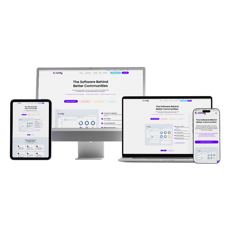

Meet eUnify
eUnify makes all-in-one software for the people who run homeowners associations, replacing the pile of disconnected tools management companies and self-managed boards were stitching together just to keep a community running. The company’s own story starts with a familiar frustration: the software built to support this industry kept making the job harder, slow support, scattered platforms, promises that never quite delivered. eUnify’s answer was to build one true platform from the ground up instead of another patchwork of point solutions, then bring communities of every size onto it, from self-managed associations to management companies running dozens of properties.
eUnify had been through a rebrand attempt before and never landed anywhere they loved, and their site was still running on Wix, a platform that undersold a product this substantial. So when they came back to Big Red Jelly, the original ask was modest: alignment, clarity, and consistency, not a full rebrand.
Brand level
Standard
Build Level
Pro
Industry
HOA Management Software

The Challenge: A Software Company That Looked Like Everyone Else
eUnify’s brand had quietly settled into the same look as every competitor in its category, and the old Wix site wasn’t doing the company any favors either. It read as sparse and forgettable, undersold a product with real depth, never spoke to the different people actually visiting it, and said nothing about the automation and lifestyle-management angle eUnify wanted to lead with. The lead-gen impact was real too: the site was pulling in a steady stream of individual homeowners looking for support, not the HOA management companies and boards eUnify actually sells to.
What eUnify Was Missing:
- A visual identity that didn’t look identical to every rival’s blue-and-green palette
- Real strengths, like hands-on, personal customer service, that weren’t showing up anywhere in the brand
- A leadership team, including a hesitant CEO, who needed convincing a full rebrand was worth doing
- A website that spoke to the right kind of visitor instead of attracting the wrong kind of lead
- A feature set large enough to overwhelm a first-time visitor if it wasn’t organized carefully
The Solution: Standing Out in a Category That Never Had To
The plan was to prove the case for change with real evidence rather than opinion, then rebuild eUnify’s brand and website around what actually made the company different: personal, responsive service and a product deep enough that it needed room to be understood, not crammed onto a page that looked like everyone else’s.
Our Focus Areas:
- Prove the case for change with real competitor research, not just an opinion
- Rebuild the brand around what eUnify actually does best, personal, responsive service
- Choose a palette built to stand out in a space where everyone looks the same
- Organize a genuinely complex product into a website simple enough for a first-time visitor


Part 01: Winning Over a Hesitant Leadership Team
Making the Case for a Real Rebrand, Not Just a Refresh
eUnify came in asking for alignment, clarity, and consistency, not a full rebrand. They’d been through a rebrand process before, never loved the outcome, and the plan going in was a lighter touch: refine the messaging, tidy up the visuals, move off Wix and onto a platform that could support a real B2B sales cycle. That changed once brand strategist Bethany Benham pulled together competitor research and laid it out for leadership. eUnify and its rivals were using the exact same blue-and-green palette, the same overall vibe, with nothing to tell them apart. Seeing that side by side, including a CEO who’d been the most hesitant in the room, was what moved the team from a light refresh to a full rebrand.
What we developed:
- A competitor audit showing eUnify and its rivals were using the same blue-and-green palette
- A clear before-and-after case for leadership, including a hesitant CEO
- Buy-in for a full rebrand instead of the minor tweaks originally requested
Part 02: A Color Story Built to Stand Out
Choosing Every Color But the Two Everyone Else Uses
Once the team was on board, the direction was clear: go anywhere but blue and green. The new palette was built to feel modern and high-end without losing warmth, closer to the range and energy of a brand like Google’s than the muted, interchangeable look the category had settled into. Small touches of personality, seasonal themes and playful details, gave the brand room to feel a little more fun and a little less buttoned-up than a typical software company.
What we developed:
- A broad color palette built specifically to break from category norms
- A visual identity built to feel modern, high-end, and welcoming at once
- Seasonal and playful details built into the brand system for ongoing personality


Part 03: Messaging Built Around What Actually Makes eUnify Different
Telling Clients What They Never Knew to Ask About
eUnify’s biggest advantage wasn’t on the page anywhere. Clients got real, hands-on customer service and regular check-ins with actual representatives, and none of that was showing up in the brand. The messaging work pulled that forward, positioning eUnify less like another piece of back-office software and more like a platform with real people behind it. eUnify’s own team put their value simply during discovery: their software could make a community manager look like a rockstar to their own clients, easy enough to use that it made the people running it look good. That became the throughline for the new messaging, alongside a tone kept friendly and a little lighthearted rather than overly formal. The site also needed to speak to more than one kind of visitor, self-managed associations, growing management companies, large master-planned communities, high-rises, and commercial developments all needed their own version of the pitch, alongside dedicated messaging for the board members, accountants, vendors, and property managers who actually use the platform day to day.
What we developed:
- Messaging centered on eUnify’s hands-on customer service and regular client engagement
- A value proposition built around making eUnify’s own users look good in front of their clients
- A friendlier, more lighthearted brand voice, without losing professionalism
- Audience-specific messaging for five distinct community types and seven user roles, instead of one generic pitch
- A positioning shift from another HOA software option to a modern, high-touch platform
Part 04: Making a Complex Product Feel Simple
Building a Mega Menu for a Platform With Dozens of Features
HOA management covers a lot of ground, parking, amenities, announcements, dues, and plenty more most people never think about until they need it. Fitting all of that into a website without overwhelming a first-time visitor was the central build challenge. The team organized eUnify’s full feature set into four clear categories: Operations & Management, Finance & Payments, Community & Lifestyle, and AI & Automation, each broken into the specific tools a manager actually uses, from violations tracking to homeowner payments to amenity reservations. A mega menu structure held it all together, able to hold a large number of items while staying easy to scan and use. The site’s calls to action got the same treatment: rather than pushing every visitor straight into a full product demo, the primary flow starts with a short intro call, giving eUnify’s team a chance to understand who they’re actually talking to before going deeper, then following up with a tailored demo instead of a generic one. The next challenge was showing how each feature actually worked. The long-term vision is short interactive walkthroughs for each module, similar to what tools like Notion use, but for launch, the site shipped with clear screenshots in place and that roadmap queued up for later.
What we developed:
- A four-category structure, Operations & Management, Finance & Payments, Community & Lifestyle, and AI & Automation, organizing a large, complex feature set into something legible and easy to navigate
- A mega menu built to hold that structure without overwhelming a first-time visitor
- A qualification-first CTA flow, starting with an intro call rather than a generic demo request
- A framework for showing each feature’s workflow, with screenshots in place today and interactive walkthroughs planned for later
- A site built to scale with the platform’s full range of HOA management tools


Part 05: Scoping a Launch Instead of Chasing Every Idea
Keeping a Big Vision on a Realistic Timeline
Once the brand and website work were underway, eUnify’s team kept generating big, ambitious feature ideas, especially once they saw what the new site could look like. Good ideas, but not all of them needed to exist on day one. Part of the job was keeping the team focused on what eUnify actually needed to launch and run, with everything else queued up for their ongoing Grow service down the road. A similar conversation came up around AI. eUnify’s product genuinely includes AI-powered tools, an AI invoice agent, an AI assistant, an AI bank reconciliation agent among them, so the substance was real. But with AI everywhere in the industry conversation, eUnify’s CEO wanted to work it into the logo and brand identity directly. The team pushed back on that specific idea, the internet was the hot new thing once too, and a brand built around whatever’s trending risks needing to be redone the moment the trend passes. The product could talk about its AI features without the brand itself chasing the trend.
What we developed:
- A phased plan that prioritized what eUnify needed to launch, with extra ideas queued for their ongoing Grow service
- A clear recommendation against building trend-driven elements, like AI branding, into a brand meant to last, while still giving eUnify’s real AI-powered features a home in the messaging
- A finished, launch-ready brand and website instead of an endless refinement cycle
Part 06: From Launch Into Ongoing Growth
Turning a Rebrand Into a Long-Term Partnership
Launching a new brand and site is the finish line for a lot of engagements. For eUnify, it was the starting point for the next one. Once the site went live, eUnify moved into an ongoing Grow partnership starting May 1, 2026, picking up the very features and ideas that had been set aside during the build so they could ship without delaying launch. The engagement now runs across three tracks working together: CRM, paid ads, and SEO, all built on the same brand and site foundation instead of starting from scratch.
What we developed:
- A direct handoff from Build into an active Grow retainer, with no gap between launch and next steps
- A three-track Grow engagement spanning CRM, paid ads, and SEO
- A pipeline for the deferred feature ideas from the build phase, now with a home instead of sitting on a wish list

Bring It All Together
eUnify went from a brand that looked like every other option in its category to one that doesn’t resemble anyone else in the space, built around the service and personality that actually made it worth choosing in the first place. The site that launched sums it up in four words right at the top: less chaos, more community. The relationship didn’t end at launch either, eUnify is now growing on the same foundation through an active CRM, ads, and SEO partnership.
Impossible to Confuse With a Competitor
A color story and visual identity that break cleanly from the blue-and-green look every rival shares.
A Brand That Sounds Like Them
Messaging built around eUnify’s real strengths, personal service and a friendlier, more human tone.
Built to Launch, Built to Last
A scoped, focused brand and website that shipped on time, with room to grow instead of a wish list that never ends.
The Conclusion: Different Beats Perfect
A rebrand doesn’t need every feature or every idea baked in on day one. eUnify’s team learned that shipping a distinct, focused brand mattered more than chasing every idea in the pipeline. What used to be indistinguishable from its competitors now doesn’t look, or sound, like anyone else in the category.
0
%
Blue or green used anywhere in the new palette, on purpose
11
Weeks from brand discovery to launch, Brand and Build combined
4
Categories organizing the entire platform, replacing one long, overwhelming feature list

Shown: Bethany Benham & Nicols Rojas
The Strategists
Bethany Benham | Brand
“We needed to build a brand that could last a long time, not one tied to whatever’s trending right now.”
Nicols Rojas | Build
“Even with a lot of items in the menu, it still needed to feel simple and easy to use.”
Let's Talk
Big Red Jelly: Your Brand Growth Partner
Big Red Jelly builds brands that grow. We blend strategy, design, and systems to help companies scale with purpose, translating what makes a business genuinely different into a brand people trust. Ready to see what a rebrand could do for your company?
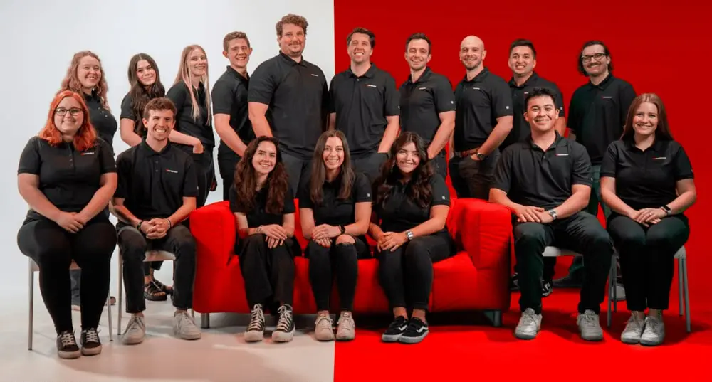
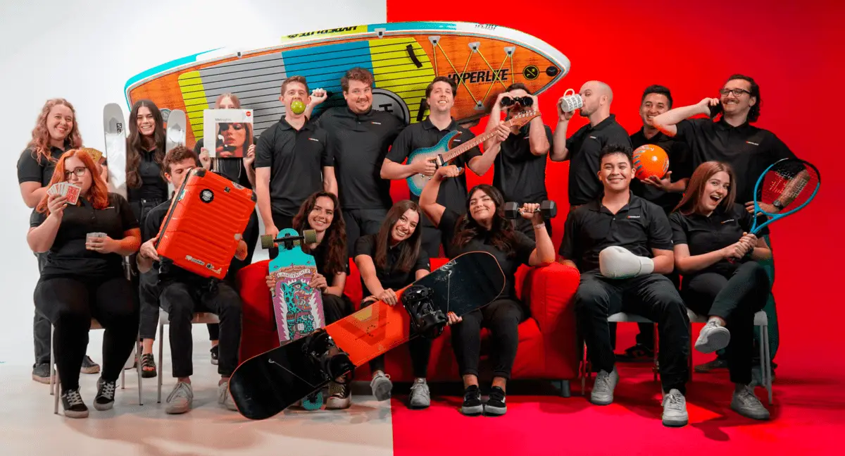
Meet the Team






Why Big Red Jelly?
At Big Red Jelly, we understand that branding is more than aesthetics, and that it’s how your organization communicates value, builds trust, and drives growth. For Utah Partners for Health, that meant creating a brand that could serve multiple audiences while staying true to a deeply important mission. We combine research, strategy, and creativity to deliver brands that look better and work better.
Let's Talk
To Elevate Your Brand & Online Experience Check Out Our Latest Articles!
The Website Isn’t the Hard Part Anymore (Lovable Changed That)
AI tools like Lovable make execution faster than ever. But the wall in creative work hasn’t disappeared — it’s just moved. Here’s what that means for web design, AI search,…

Read MoreRead More