Summary:
Who this article is for:
- Entrepreneurs
- Small business owners
- Marketing team members
- Self-employed marketers
Key takeaways:
- Your visual brand identity incorporates elements from color theory, typography, and your brand values
- Simplicity is usually best
- Easily-recognizable branding builds brand trust and makes your employees’ jobs easier
What’s inside:
- What is Visual Branding?
- Why Does Visual Branding Matter?
- How Can You Build A Cohesive Visual Branding Identity?
- The Building Blocks of Your Visual Brand Identity
- Where Should You Start?
The visual representation of your brand — what we call your visual branding identity — is more important today than ever before in business and marketing history. What started as simple attention-grabbing colors to pull people off the sidewalk and into a store has become a multi-billion dollar industry where entire brands rise and fall based on the quality of their visual identity.
The better, faster, and more effectively your brand’s visual identity communicates its value to customers, employees, and stakeholders, the more valuable that brand identity becomes. But how do you create a logo and identity that is powerful and approachable, artistic yet professional, simple yet striking, and timeless? Despite what some agencies will tell you, you don’t need to pay a small fortune to find out. We’ve got you covered.
What Is Visual Branding?
Your visual identity, or visual branding, goes beyond your logo. It includes every way in which your brand presents itself to your audience — intentionally and unintentionally. It incorporates your logo and all its elements, your brand style, how your employees appear and present themselves, the language you use, and where and how your brand appears digitally and physically.
Visual cues such as your logo, color palette, and typography help audiences recognize and connect with your brand. The most powerful and effective brands always incorporate every aspect of their identities and consistently track how their brand is being presented and perceived. Brand identity refers to both the internal values and personality of your brand as well as the external visual components that represent it.
Why Does Visual Branding Matter?
A thoughtful brand design system not only enhances your brand but allows your brand identity to take on a life of its own. An effective visual identity can do all the heavy lifting of marketing to your audience by communicating the values, traits, and unique position of your brand — while also building an emotional connection with customers that fosters loyalty.
On the other hand, lazy or careless brand identity can undermine your brand and restrict business growth. At the very least, following basic visual branding principles helps you avoid common mistakes that have doomed businesses of every size.
Your visual branding supports two primary goals:
- Building Brand Recognition — How quickly and easily a customer recognizes your brand from its identity. Whatever helps people think of your company first when they see or hear something should be incorporated into your visual branding.
- Building Brand Trust — The emotions and initial reactions your audience has to seeing your brand. This refers to the reinforcement that happens when a customer has a positive interaction with your brand and then has that positive feeling confirmed when they see your brand again.

How to Build a Cohesive Visual Branding Identity
No matter what part of your identity you’re working on, tie every decision back to a common question or goal. At Big Red Jelly, one of our go-to questions is: “What is the message we are trying to communicate?” This avoids simple yes/no answers while keeping branding decisions focused on your ultimate goal.
One of the first steps in our branding process is identifying the key values of your brand. These values represent where you want to go, how you plan on getting there, and the principles you operate by. Your visual brand identity should communicate those values to your audiences in the most effective and efficient way possible.
The Building Blocks of Your Visual Brand Identity
The common elements of any good brand design system include color, typography, graphics and imagery, sounds and music, presentation, cohesiveness, and time and place. We’ll cover a few key ones here.
Color
Humans are very responsive to color, and some colors elicit certain emotions or memories when we see them. Understanding what certain colors communicate can make a massive difference in how your message is received by your target audience.
- Warm colors (reds, yellows, browns) are associated with daylight and sunsets. They appear more active, advance toward the viewer, and arouse or stimulate more than cool colors.
- Cool colors (blues, greens, violets) are associated with overcast days and nights. These recede away from the viewer, have a calming effect, and carry a less energetic feeling.
When picking colors, ask: What emotion do I want my brand colors to communicate? Do the colors complement each other? Are they appropriate across all contexts and environments?
Typography
Every font has its own personality that it shares with your brand when paired with it. Fonts from certain time periods and cultures carry nearly as strong a message as the words written with them.
- Sleek, sans-serif fonts are easier to read and communicate a fast-paced, modern message — common with tech and online companies
- Bold, serif fonts present a more formal, established brand — preferred by print companies, government departments, and well-respected institutions
- More extreme fonts send a very clear, specific message — powerful when used intentionally, but keep your brand name font and internal communication fonts within the same family
The rule of thumb: clarity is always better than style. If a beautiful font is too difficult for customers to read, opt for something more legible.
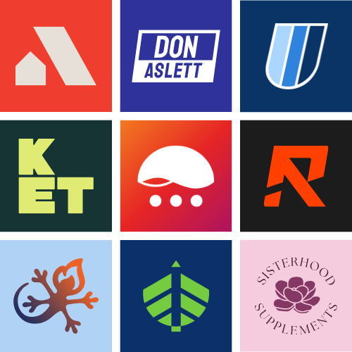
Graphics and Imagery
The graphics and imagery you incorporate extend beyond a mascot or logo. When deciding what to include, follow the same principles as great flag design:
- Your brand identity should be easily identifiable from a distance and not confused with other established brands
- It should be easily replicable — complex logos are harder to remember and more difficult for employees to work with
- It should be recognizable even when viewed at the wrong angle or in a damaged state
- Use as few words as possible — if you can communicate your brand value with just your company name and one or two words, do so
Sounds and Music
We don’t typically associate sound with visual branding, but it absolutely has an impact. Think about the trademarked “Deep Note” that plays when the THX logo appears, or the “Da-dum” of the Netflix logo. Millions of people now hear that sound whenever a red letter “N” shows up anywhere.
This extends beyond actual sounds. Think of a music store: the typography and imagery usually communicate a certain type of music without a single note being played. You can’t fully control what your audience hears in their imagination when they see your brand — but you can make intentional choices that guide it.
Where Should You Start?
It can feel overwhelming when you begin the visual branding process. Trying to stay current without wasting money on unnecessary rebrands is a tricky balance. The sign of a truly strong brand identity is how little it has to change over time to stay effective — changing your branding too often waters down your message and doesn’t give your brand enough time to build trust.
Luckily, we’ve been helping businesses build powerful visual brand identities for years. Our branding services are designed to help you build a visual identity that is consistent, powerful, and actually helps you achieve your business goals. Whether you’re starting from scratch or refining what you have, our team of strategists is ready to help. Check out our free branding resources to get started today.

Written by Aaron Webber, Jr.
Frequently Asked Questions About Visual Branding Identity
Do we have to rebrand? Can we keep our existing brand identity forever?
You can absolutely keep your existing brand — including logo, name, and other visual branding elements — forever. The sign of a truly strong brand identity is how little it has to change over time to stay effective. Changing your branding too often waters down your message and doesn’t give your brand enough time to mature and build trust with your audience.
Do you offer design services just for logos or brand style guides?
No. We don’t price our services separately. Every step of our branding process supports and builds on the others. We guide you through our process so you understand your brand on a much more fundamental level.
How many colors should we include in our brand identity?
We recommend two signature colors and 3–4 secondary colors, usually different shades of your signature colors. A great way to find out what works is to create a couple of examples with your color options and see which ones you like most and which ones your customers react to best.
Is it better to stand out or match tried-and-true methods within our industry?
There is no universal right answer — it varies wildly from industry to industry. Some industries stick to the same visual branding elements for a reason, while others simply play it safe. A great place to start is looking into the history of branding in your industry and speaking directly with your customers.
Do we need a brand style guide?
We strongly recommend it. A brand style guide — which can be as simple as a list of colors, fonts, and key elements — serves as a benchmark and foundation for all your branding and marketing decisions. Without one, you’ll be surprised how quickly your brand starts appearing in all sorts of inconsistent ways across different channels.