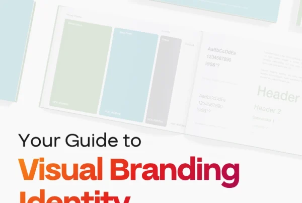
Logos help make your brand recognizable and appealing, but you want to make sure it stands out and is memorable for the right reasons, so your design choices should be strategic and intentional. Beyond aesthetics, there are other notable benefits of creating a great logo: recognition, revealing an appealing and consistent brand personality, certifying yourself as a professional authority, and creating brand loyalty.
Once you have a grasp of your vision, you know who you are as a company and you are ready to start designing, here are five key principles to keep in mind when developing or refreshing your logo.
1. This is NOT a “more is more” moment
I know that you might be eager to break out text effects and patterns, but the point of a logo is a simplified visual that represents your company. If it’s too busy, colorful, or complex, it may make it difficult to see from far away, hard to merchandise, and overall just look unprofessional.
Logos shouldn’t have lots of detail or too many colors, and it needs to be recognizable on both a small and large scale. The original Milwaukee city flag is an infamous example, created in 1955 by merging many different submissions into one design.
(By Fred Steffan, 1955)
The new City of Milwaukee flag, “Sunrise over the Lake” by Robert Lenz, 2016)
DON’T DO THAT.
Thankfully, the Milwaukee flag was redesigned in 2016. Twitter’s bird icon and the Target… well, target are both great examples of logos that have really understood the simplify principle.
2. Cool motive, still bad logo design
Busy logo designs are often a result of trying to do and say too many things, but oversimplification can make your branding too abstract or unrecognizable.
You want to make sure you are both distinguishing yourselves and that your brand visuals actually connect to your business. Apple does a great job of keeping its packaging and designs sleek and simple, but easily recognizable.
How about another example. Kumon is a children’s math and language education program, and their logo is pictured below. It’s a nice color, solid font choice, and certainly recognizable, but can you see where their logo might take a hit to their credibility? It features the infamous “thinking face” of a child working through a problem, and Kumon has stuck by it, but there has been some pushback from users and logo designers on the choice.
![]()
If your logo is unconventional, but you feel strongly that it’s right for your company, that is a strategic choice for you to make, but ensure that your creativity doesn’t alienate your audience.
Designers should boil down to the most essential elements, details, colors, and visuals. You can’t say much within a logo, so make sure it counts.
3. Don’t make it weird
Ensure that everything included in your logo matters, whether that be a mascot, or an icon or text. You can have a great concept, high quality graphics and still send the wrong message.
WARNING: make sure you are not saying something you don’t mean.
Take a look at the logo for Mama’s Baking; clean lines, consistent colors, and an appropriate font. But what do you see when you look at it?
![]()
Pay specific attention to things like:
- Kerning: the space between letters
- Quality: media not pixelated, blurry, or overly small
- Font: the font is legible and appropriate for the industry
- Alignment: where media, text, and images are placed are balanced and not off putting or misaligned
- Dimensions/versatility: keep in mind where the media will be placed and ensure that you can make the media work well in the space provided
And please, please, please make sure that your media gets in front of the eyes of multiple people before you attach it to your company.
4. Avoid the bland, basic, and boring
Great visuals are a great way to capture attention! Pictures, icons, and shapes also attract the eye and break up monotonous text. Clean lines, good color choices, and dynamic shapes can all make a single image more recognizable and pleasing to the eye.
When deciding your visual elements, you might ask yourself a few questions like:
- What physical objects are associated with my company, business, or industry? — Like Instagram or Steam
![]()
![]()
- What emotions or motivations does my business evoke? — Like the IHOP smile or the Nike check and “Just Do It” trademark
![]()
![]()
- How can I creatively combine the name or initials of my business? — Like Airbnb and CNN
![]()
![]()
- Something that we’ve been seeing a lot of in recent history is companies rebranding logos to be exclusively text, the fashion industry in particular.
Modern research recommends businesses include a brand’s name within its logo as it can be more appealing and recognizable to consumers, but it can also make it… boring. The Harry Potter and Star Wars fonts are instantly recognizable, no matter the text, but if I saw something written in Utah Condensed Bold, would your mind immediately recognize the font from Balenciaga?
Once again, it’s all a balance. Text is a tool like any other, and it can be used incredibly well or it can take potentially memorable elements out of your media. Take a step away from the font drop down and see what visuals you can incorporate to create a snapshot of your company.
5. Don’t make it hard on your viewers
This last statement is pretty general, but it’s vital to the success of your logo. You want your visuals to be appealing, recognizable, simple enough to recreate and convey relevant ideas about your company. Every time your media is viewed, you have a chance to engage your audience; don’t give them a reason to look away or forget you.
In review, keep it simple, make it relevant, double check your details, make it nice to look at, and make sure that you are sending out the right message.
If you are looking for professional insight on your company’s brand, click here for more about how Big Red Jelly can help your company elevate your brand!
Written by Abigail Marks.