The Legend of Zelda is one of the longest running game series, starting with the release of The Legend of Zelda in 1986 up until 2023 with the release of Tears of the Kingdom. For the last 3 decades it has been beloved by fans of all ages and has grown to be one of the most popular video game series of all time. In honor of the release of Tears of the Kingdom, let’s take a look at The Legend of Zelda’s logo evolution from the original, until now.
The Legend of Zelda
![]() The Legend of Zelda (1986) was the first game of the series released. This initial logo sets up a few patterns that have been used consistently throughout the years all centering on the word “Zelda.” Those major repeating patterns include the bold red color, Zelda in all caps, and the sharp, triangular serif on the typeface. This first logo sets up the series nicely by having repeating recognizable elements, while also being simple enough to leave room for adjustments.
The Legend of Zelda (1986) was the first game of the series released. This initial logo sets up a few patterns that have been used consistently throughout the years all centering on the word “Zelda.” Those major repeating patterns include the bold red color, Zelda in all caps, and the sharp, triangular serif on the typeface. This first logo sets up the series nicely by having repeating recognizable elements, while also being simple enough to leave room for adjustments.
A Link to the Past
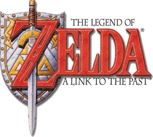 A Link to the Past (1991) paves the way for one of my favorite repeating elements in the series: the inclusion of The Master Sword. While Zelda II: The Adventure of Link (1987) included The Master Sword on the cover art, A Link to the Past is the first time The Master Sword is embedded within the logo. Another first is the appearance of the Triforce within the logo, which is another integral part of the storyline.
These add a deeper connection to the actual story and make the logo more visually interesting. A Link to the Past’s logo has a lot more character displaying a diamond design in the “Z”, even sharper serifs, and a distressed effect on the illustrations and font that suits the genre and storyline. These small elements along with a beveling effect are features that are carried on in future Legend of Zelda logos.
Majora’s Mask
 The next major change is with the Majora’s Mask (2000) logo. Instead of the canonical red text Majora’s Mask uses a purple that matches the illustrated mask behind it. Majora’s Mask has a very unique and memorable story line, so it is only fitting that the mask would make its way onto the logo. The eyes peeking out from either side of the “Z” fit the dark, and creepy theme of the game.
From 2001 to 2009 the seven Legend of Zelda games that were released all followed similar patterns, using the now highly recognizable sharp serif font with a large “Z” and typically being accompanied by an illustration specific to each game. Many included a stylized font displaying the title of each Legend of Zelda game in various colors below the main logo.

In Skyward Sword (2011) we see the first logo usage of another important symbol: The Royal Crest of Hyrule Castle. While this symbol does not repeat as often as The Master Sword in following logos, the crest itself is often used on cover art, merchandise, and throughout past and future games in the series.
A Link Between Worlds
 A Link Between Worlds (2013) and Tri Force Heroes (2015) are the last instance where we see the familiar red and beveled text. Instead, Nintendo opts for a modernized logo style in both Breath of the Wild (2017) and Tears of the Kingdom (2023). Winning game of the year in 2017, Breath of the Wild is a vibrant game with an art style heavily featuring ancient architecture, sci-fi elements, and a Japanese inspired animation style.
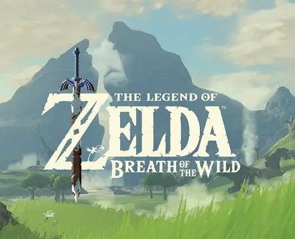 The logo is flat and typically presented in one neutral color, with the exception of the 3D Master Sword piercing through the “Z.” The text continues to have a weathered or distressed effect, but it is pushed even further in Breath of the Wild to reflect world conditions the gameplay takes place in.
All text in the logo is presented in the same typeface, rather than presenting “Breath of the Wild” in its own separate font. This makes the logo more cohesive overall, and draws more attention to the damaged Master Sword.
Tears of the Kingdom
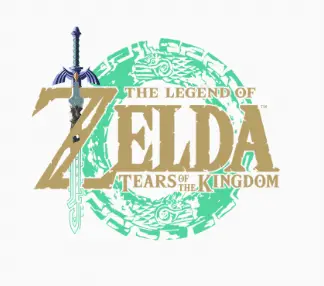 Tears of the Kingdom is presented as the sequel to Breath of the Wild, so the two logos being the same style suits them well. Tears of the Kingdom follows the same neutral tone, and flat illustration style with the addition of the vibrant teal circle in the background. Additionally, The Master Sword is still presented more detailed than the wordmark, with the exception of the bottom of the sword. The bottom matches the color and style of the teal circle and references an important plot point in the game.
As someone who waited with excited anticipation for the release of Tears of the Kingdom I remember picking apart its logo; seeing where it matched the Breath of the Wild logo and obsessing over the differences. Tears of the Kingdom does a great job representing the game as a sequel, while also providing an identity unique to its plot and playstyle.
The Legend of Zelda series logo is very recognizable with unique additions of small illustrations or elements pulled in to reflect each game’s identity and story. They function well as game logos within a series and have managed to keep a consistent look and feel overtime while still keeping up with current design trends
Thinking about your own logo evolution? Big Red Jelly’s brand design team helps businesses build logos and visual identities that stand the test of time — just like the ones above.
Written by Ali Reimer