Today we’re going to go over some website design best practices, as well as very common mistakes that we see when we’re reviewing a client website.
Call to Action Page
One of the first online tools that we like to implement is giving clients or customers the option to contact you, get a quote, or schedule a consultation through several different options. This can differ depending on your industry and how you prefer to be contacted. But generally speaking, when we’re working with small and even mid-sized businesses and we look at their call to action page, contact page, or their consultation page, we’re always pretty shocked at just how much missing information there is. There might be just a contact form, but there’s no phone number when they definitely need one.
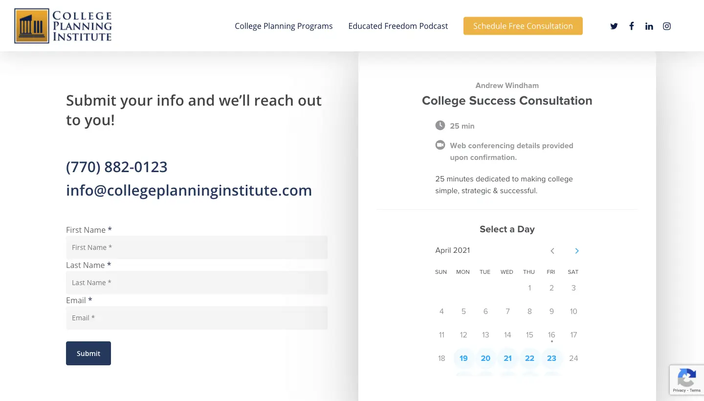 As you can see here, College Planning Institute (CollegePlanningInstitute.com) has two columns on the “Schedule Free Consultation” page with several contact options. If you’re a client who’s more in exploration mode or just looking for a quote, then you might complete the form. It’s not going to be as time-sensitive. It’s going to submit the info and their responsibility is to reach out to me. That’s a much more passive approach.
But as you can see, the email and phone number are also listed, and if you click on the phone number from a mobile device you have the option to call. Too often, small business websites just have text for the phone number, not a button or a link. Have you ever tried to copy a phone number using your thumb on a mobile phone while you’re in a meeting, talking, or driving? It’s horrible. Mobile-responsive website design gives you a big advantage over the competition.
But why not skip all of this? If you know you want to get started and you want to take advantage of the free consultation, just go ahead and schedule with them?
Calendly
Use a tool like Calendly, for example. Calendly is great. We have used Calendly for years because there’s a great free version and there’s a lot of fun stuff you can do with it. As you can see here, you can customize it as well. It syncs with your calendar, so it’s only going to show times that you are available. If you go and edit my calendar and I’m blocked off Thursday for a doctor’s appointment and I use Calendly, it’s not going to have those time slots available for my customers or clients.
We’re shocked that more business owners are not taking advantage of these real-time synched calendars. They save so much time. They’re going to help you get more leads. They’re going to help you get more business.
I can tell you from personal experience, we went through our Big Red Jelly website and we started putting in embedded calendars using HubSpot, or CRM, very similar to Calendly. And right after we did that and we put those calendars on our call to action pages, we saw a significant, measurable difference in scheduled calls from real people who wanted real advice.
Relevant Home Page
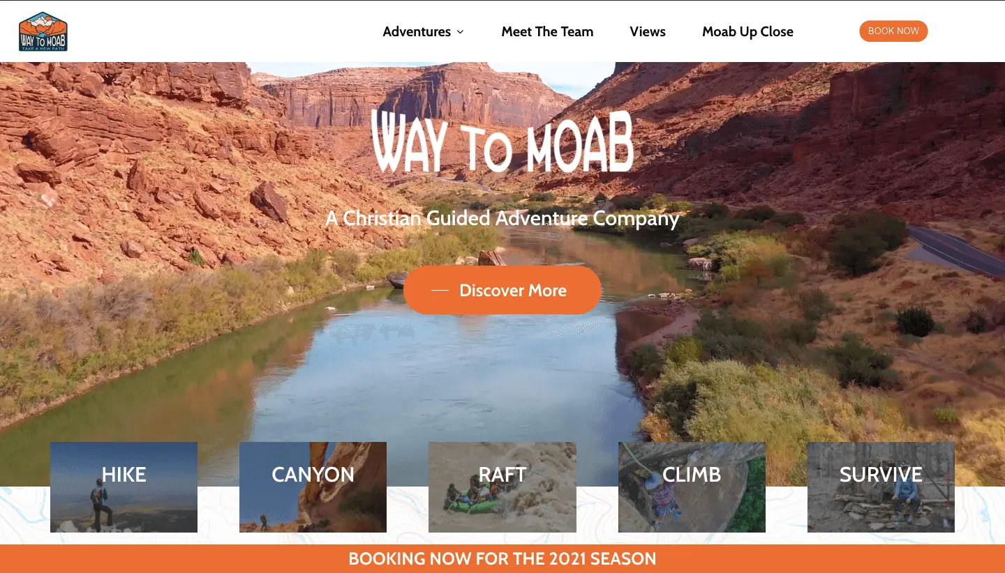 This is WaytoMoab.com, a website for an amazing tour guide company. One of the things that we like about their website design is this little banner at the bottom, “Booking Now for the 2021 Season,” even though it seems minor looking. Point number two is try to have something that’s time or season relevant on your home page.
A lot of people will design a website or digital platform and say, boom, it’s done. Maybe I’ll refresh it five years from now. The home page is probably going to be one of your most visited pages. You should have a promo, discount, something that’s seasonal, something that’s relevant. It shows that your business is updating your website consistently. It’s growing. It’s changing. It keeps up to date.
As human beings, generally, we have a hard time thinking far ahead in the future. If you’re an e-commerce brand, there should be a banner or something there that says 25 percent off until the end of this month. There’s a price and a time incentive.
So think to yourself, what’s a banner coupon, discount, an event, something relevant that can be added to your home page and something that you can update on a monthly basis. You will see results from something as small as that.
Testimonials
This is something we see again and again with local businesses. They don’t have any testimonials or reviews listed on their website–at least nowhere really easy to find. What a lot of people do is they will have a page where they dump all their testimonials. Or they’ve just got one section where they’ve got testimonials and then nowhere else.
 Here on this website (triedntruecoaching.com), there are actually testimonials on several pages. Above is an example of a carousel on the homepage with some testimonials. Even though these are static testimonials right now, adding validation onto all the information that was digested before is priceless.
Don’t be afraid to strategically place single testimonials throughout your site. Small business owners do that nearly enough, especially if that testimonial is relevant to the information that it’s next to.
Let’s say you have a bio about you on a team page. You might have a testimonial from a client that says it was great working with you. It adds validation to the information that someone just digested by visiting your website. Do not be afraid to be strategic with your testimonials, your reviews, your case studies. They’re great website design tools because they add validity to the information on your website.
Live Chat
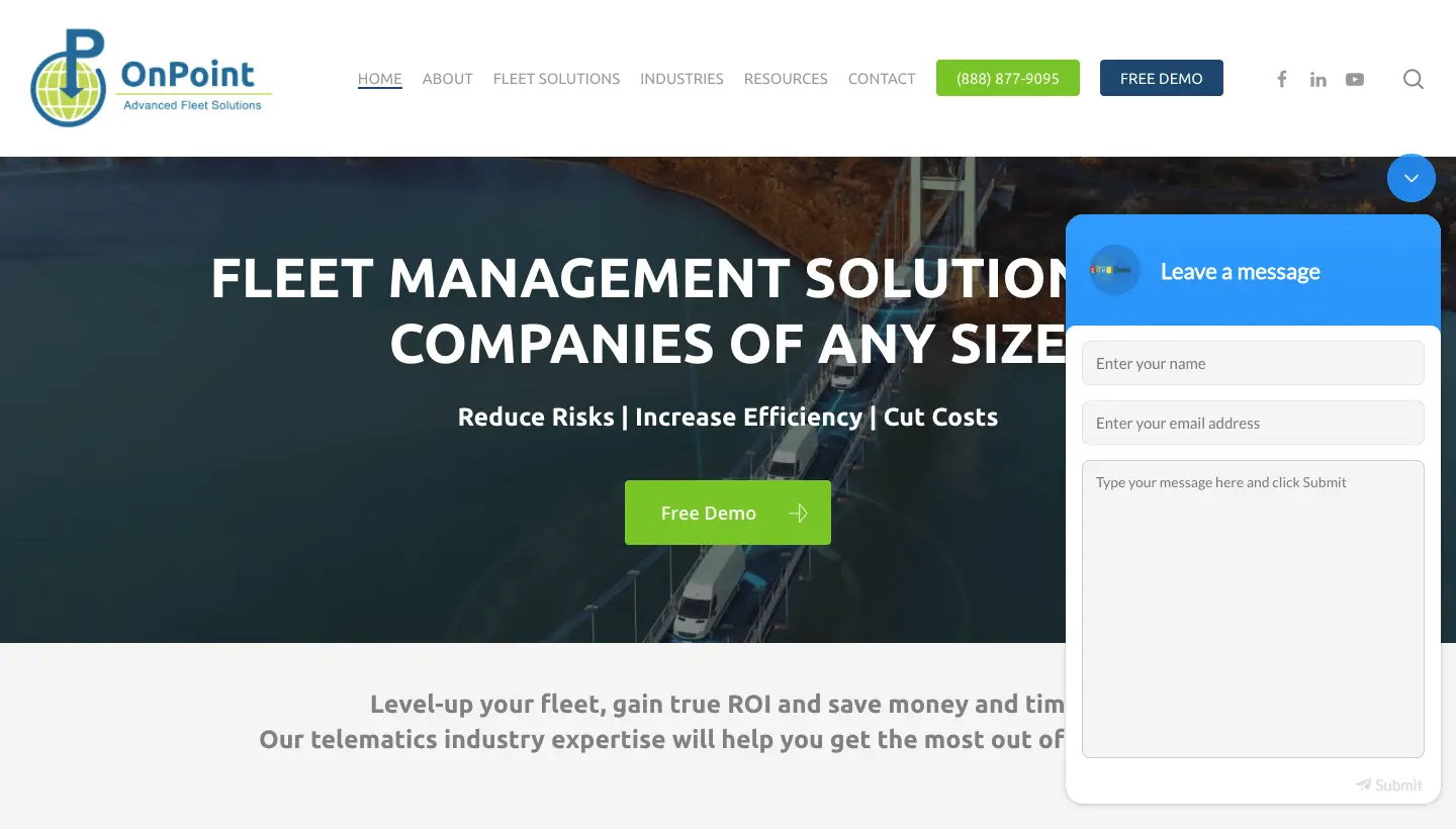 Second to last point is just some very basic but easy to set up tools like this OnPoint website that we built (OnPointavl.com). As you can see here in the bottom right hand corner, this is a live chat plugin using the Zoho CRM, which was their preferred CRM. It’s like a sales software. This is a live chat tool when someone on their team is online, this will give a little green light. It will show that someone is online and when they’re not. It turns into a really easy to find contact for these tools.
There’s so much you can do and it can feel like you have an additional mini me who’s doing this work on your website while you’re asleep or while away. Think about a CRM, live chat, chat bot, or a combination of the two. Really leverage your time a little bit better by using these tools. We have other videos and posts about tools like Live Chat Chat,
Secondary Call to Action
 Let’s take a look at this website: Get in the Cashflow Game (GetintheCashFlowGame.com). It’s a very fun brand with a great website that we made a while ago.
Something we don’t see a lot of business owners do very well is offer secondary content for clients. As you can see with Get in the Cashflow Game, toward the bottom of the homepage there’s kind of this secondary call to action, which is getting a free video course. A lot of people say, well, I want people to call me, I want leads, I want them to fill out my form. That’s your primary call to action. But are there other things that you could provide for the majority of your website visitors who aren’t ready to pull the trigger and do business with you right now?
We challenge you to think about offering something of value that you don’t need to be paid for. What could you share with future customers that might warm them up to do business with me in the future?
This is applicable to just about every industry out there. So as you can see here, this is a video course, which is a little more complex. If you were to fill out this form, it sends you an email sequence with videos and once per week each email comes with a new video. It’s really cool and really engaging.
It’s always helpful to have a secondary call to action on your website. You’d be surprised how many people would take advantage of that.
Learn More
These are just a few website design tips and tricks we like to implement in websites and online business strategies for most of our clients. Hopefully you found one or two of these to be helpful for you.
And don’t forget, you can go to bigredjelly.com/comeback and download the free guide to read about more of these points or schedule a free consultation with our team.
Let’s get to work and build something fun together.