To challenge ourselves creatively this quarter, we decided as the Big Red Jelly Brand team to reimagine one of our favorite drink places as if it existed in the 70s, 80s, 90s, and 2000s. Each of us would work within one of the nostalgic decades and recreate the Swig logo to fit that era. Then to finish the designs off, we would add accompanying patterns to create the final effect.
With our plan in place, we threw the eras into a hat to decide who would do which one, made a visit to our local Swig (for research purposes of course), and got to work.
The Groovy 70s
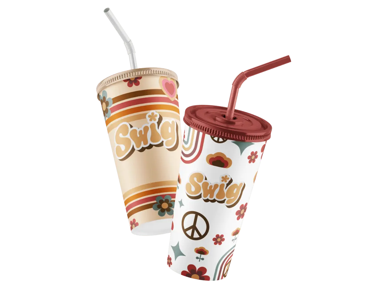
When researching 70s design, we saw a lot of thick, funky fonts, lined patterns, and tons and tons of flowers. From there, we looked at Swig’s original logo which has 2 water droplets in the title of the “i.” This gave us the idea to use a flower for the “i” in the 70s version to tie in all the flower power from that era. We then found a bubbly font that had a groovy feel to it and added some drop shadow effects as was popular during that time. Lastly, we applied the dominant color hues from the 70s: muted yellows, browns, reds, and teals. The final result, combined with some fun patterns, gave the design a cohesive 70s look and feel.
Neon-Soaked 80s
Design in the 80s was packed full of vibrant colors and geometric patterns with dark backgrounds to contrast. Chrome and Neon were prevalent throughout labels, typography, advertisements, and more. We took inspiration from the 80s with these high-contrast colors and neon effects, then took a closer look at Swig’s current logo.
Swig’s logo often pushes through the circular shape that encloses it, with the “S” and the “G” falling outside that circle’s boundary. We found a chunky, energetic font and enclosed it in two triangles made up of glowing neon lines. Like the original Swig logo, we had the text push outside the boundary of the triangles. We added Swig’s original red as well as some purple and put our vision of the 80s Swig logo on a black backdrop so the colors and neon would pop.
Grunge of the 90s
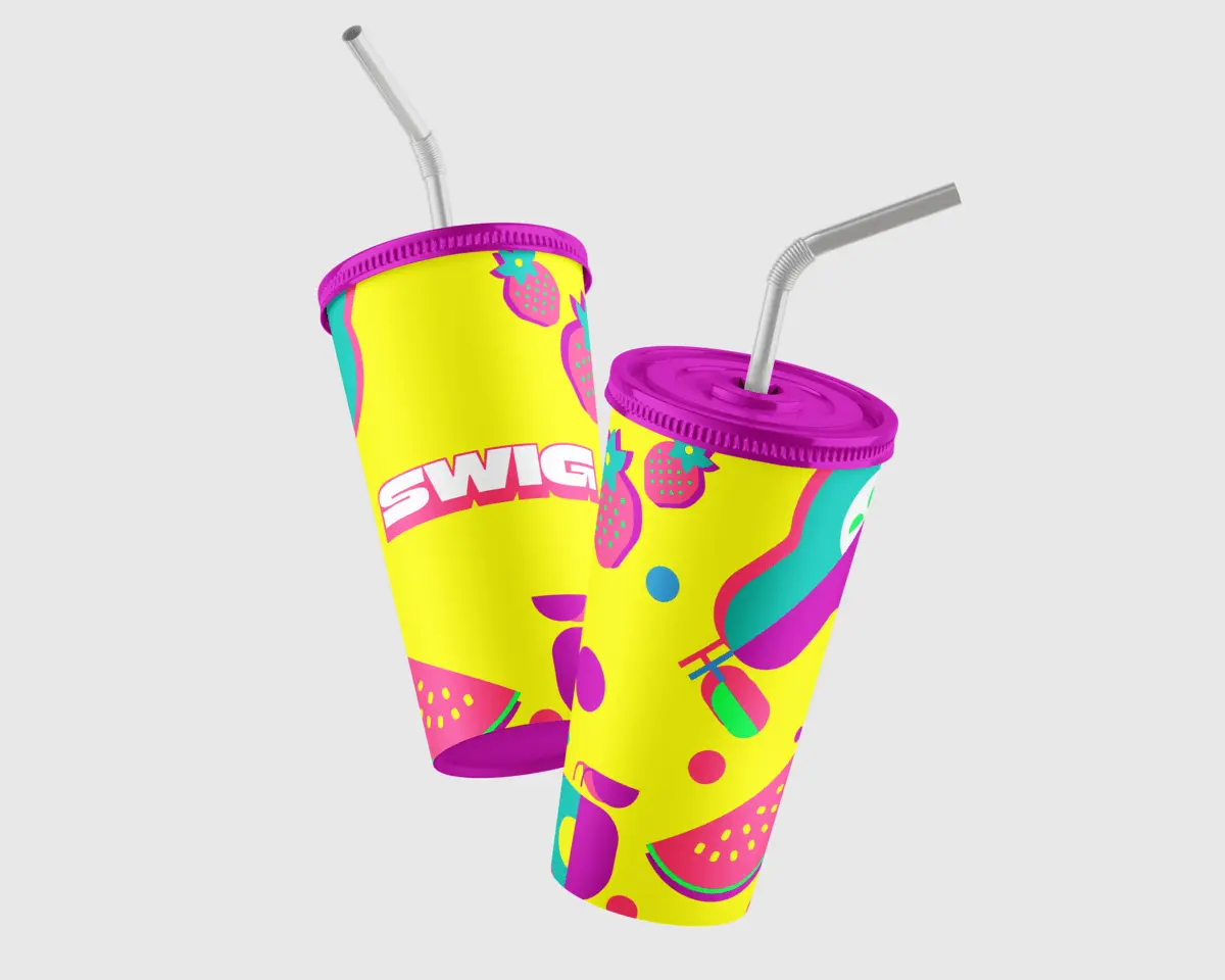
The ’90s were truly a wild time! We found many different styles, colors, and designs to choose from. But there was one recurring theme that started in the 80s that we couldn’t pass up…neon colors. I guess you can say that “old habits die hard”. We stayed true to Swig’s original wordmark by keeping it simple and letting the font do the work. The font (Gabriella Heavy) gave the logo the perfect “90s Grunge” and some much-needed weight. The solid drop shadow below the text allows for a sense of nostalgia from the 80s but with a 90s twist. The supporting graphics of the funky fruit allowed for a great visual experience while maintaining the drop shadow theme.
Y2K Skater 00s
The primary challenge in crafting a brand in the early 2000s was to distinguish it from the trends of the 90s while infusing it with a distinct nostalgic touch. Selecting a specific theme of the 2000s, such as the Y2K style, really brought life into the design. Drawing inspiration mainly from the skater vibe served a dual purpose—it appealed to a niche demographic and allowed for the incorporation of unique design elements from the 2000s. The use of highlighter blues, purples, and pinks as primary colors, along with stars and swoosh shapes, effectively transported the aesthetic to a reminiscent 2003, capturing the essence of that era.
Design Through the Decades
Reflecting on the preceding decades unveils the dynamic evolution of design, showcasing how trends emerge, fade, and get reinvented. Each era, from the thick, funky fonts and floral extravagance of the 70s, to the neon-soaked vibrancy and geometric precision of the 80s, and onward to the grunge aesthetics and bold neon resurgence of the 90s, along with the Y2K skater vibe with its highlighter hues in the early 2000s, provided a creative playground for us, enabling the exploration of diverse elements, all within the framework of one of our favorite brands.
